‘Life is finite’ – a column by Dikkie Scipio
Dikkie Scipio continues her quarterly columns for ‘de Architect’ magazine. Read the full essay below!
Available in Dutch here.
Alive, dead, and inanimate. These are the categories you learn in school: plants, animals and people are alive until they are dead; and glass, stone or concrete are inanimate, having never lived (at least not in a similar capacity). We can use living and dead things to feed ourselves and keep us warm. We can use inanimate materials to build things. It’s relatively easy to build a tent from branches and animal skins or a simple house from wood and straw. But dead materials are in that vulnerable state between living and vanishing: too wet and they rot, too dry and they can catch fire. So inanimate materials would have been better. Glass, stone and concrete are – if stacked properly – safe and permanent. Stone and concrete were the material of choice for important people and for security or stability where necessary. Plants were considered purely as useful for food and medicine.
One had to be very wealthy to be able to afford using land for something other than cultivation. Lawns as we know them today – austere planes of greenery with no purpose – were only invented when garden-architect André Le Nôtre designed a small tapis vert in 1662 for the gardens of Versailles. This was confirmation of the king’s extreme wealth. Motifs inspired by nature were certainly always part of the vocabulary of architecture and interior design. However, these were artful interpretations of plants and flowers, not living greenery.
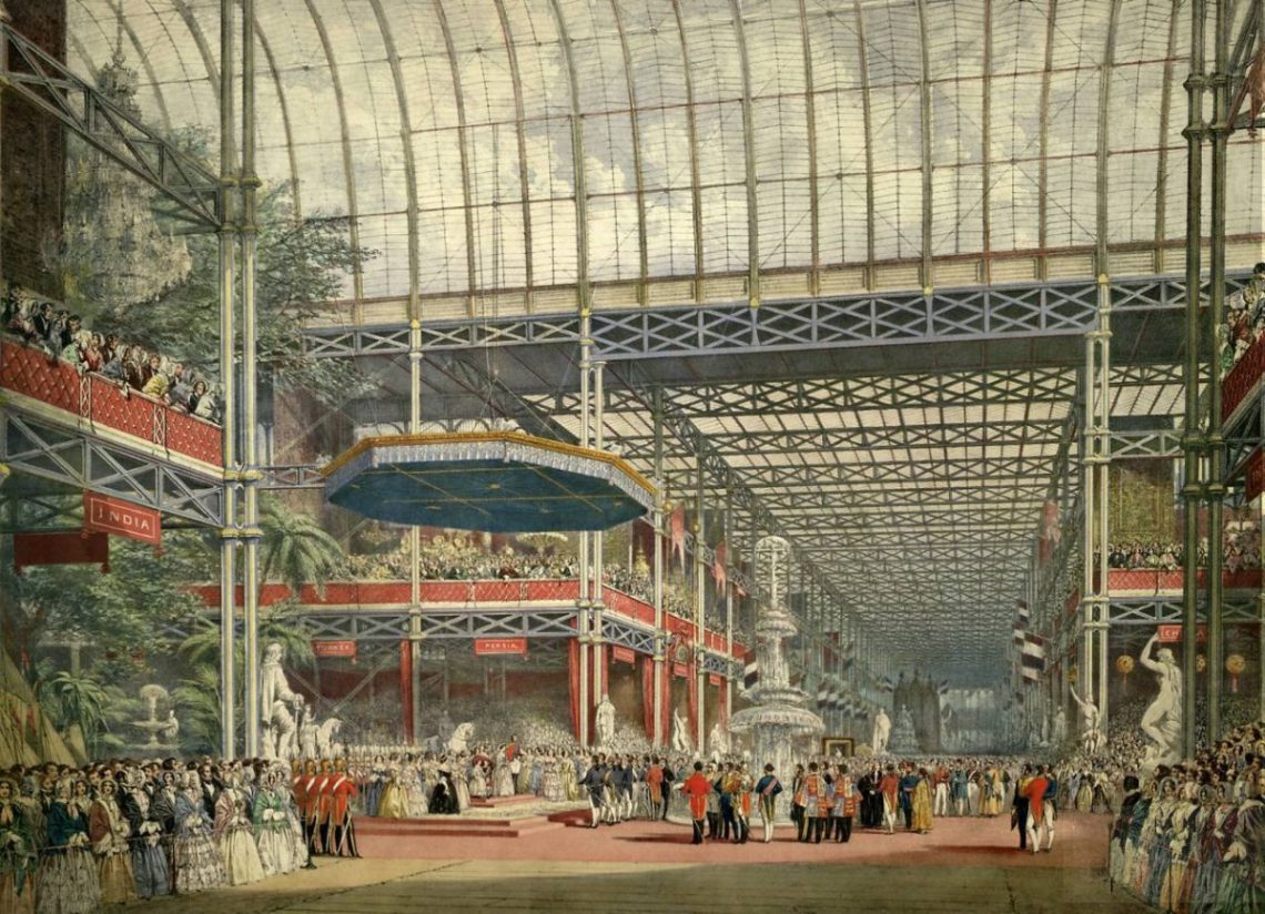
It was only once sailors and adventurers returned to Europe from the colonies with hitherto unknown curiosities that living plants started to move indoors. Keeping and displaying a tropical plant in the parlour became the height of fashion. With the Industrial Revolution, increasingly filthy cities, and a diminished relationship with nature, the popularity of the plant as a decorative interior element grew. Joseph Paxton’s giant greenhouse for the Great Exhibition of 1851 in London, the Crystal Palace, attracted huge crowds. And in the meantime, machine-made reproductions of valued furniture were exuberantly combined with plants and decorative paraphernalia in overcrowded sitting rooms. An accumulation of so much poor taste spawned alternative directions, simultaneously between 1890 and 1914: the Art Nouveau, the Arts and Crafts, and the Jugendstil. Each style employed plant-based themes and excelled in craftsmanship and elegance.
Yet they didn’t last. The world wars put an end to the ability of old families to invest in craftsmanship in architecture, art and decoration. The demand for clean, healthy, light-filled architecture was met by Modernism. Ornamentation was renounced, though greenery remained important. Small and easy-to-care-for potted plants became part of simple home interiors, and the villas gained inner gardens integrated with interiors. There are some beautiful examples of this in the architecture of Berthold Lubetkin, Hans Scharoun, Frank Lloyd Wright and John Lautner. After this, the fashion of integrating living plants with architecture came and went. When the cities and the air became cleaner, the plants were left to die.
But then came the vertical garden of Musée du quai Branly by Jean Nouvel in 2006. Since then, many roof and façade gardens have been built, culminating in Milan’s Bosco Verticale, a structure comparable to the gardens of Versailles in their beauty, expense, and maintenance. The green theme is once again peaking and living plants are being installed everywhere into, onto, and around architecture in the most inventive ways.
Inescapably, ‘living’ also means maintenance. A living plant needs to be nourished and protected against diseases. Even a much-cherished plant can die. We are not very good at taking care of our surroundings and giving them the attention they deserve. Perhaps we’ll learn through our plants that we should also look after our buildings: achieving sustainability through the maintenance of quality. Now that the prohibition on ornamentation has been lifted, we may once again enjoy flowers and plant-like motifs on our wallpaper and upholstery. In the unlikely event that we are unsuccessful in our care responsibilities, we can always fall back on the precept that inanimate is still the safest bet.
Prof. Dikkie Scipio
Q4 2021 De Architect
‘Living Apart Together’ – a column by Dikkie Scipio
Dikkie Scipio continues her quarterly columns for ‘de Architect’ magazine. Read the full essay below, focusing on the blurred lines between the public and the private space.
Available in Dutch here.
The 19th-century city was dirty. The housing was wretched and unhygienic. The streets were filthy, heaped with a combination of horse excrement and rubbish. Single dwellings were overcrowded and sanitation was either absent or shared and outdoors. Boundaries between public space and private domains were left undefined. The Dutch Housing Act of 1901 forever changed this. Light, air and space were the answer to the often miserable and unhygienic conditions people lived in. The concept of a healthy mind inhabiting a healthy body was born. And “healthy recreation” in public space made its debut. The new housing law not only ensured that eventually every home would have its own kitchen and sanitary facilities, but that there would be more green spaces for communal use, maintained by the municipality.
As a consequence, notions about public and private spaces changed. Gone was the ambiguity between the two. Inside the home was private and everything outside was public space, shared by all. This meant, quite literally, that public space was a formal domain where one behaved differently to when in private space. The separation was clear and dominated by written and unwritten social rules until the 1960s when behavioural norms started to relax. A new kind of optimistic social conduct emerged which encouraged a more casual interaction and looser demarcation between public and private, so that there would be room for everybody.
An excellent and typical example of this Zeitgeist could be seen in the architecture of the Dijkzigt University Hospital in Rotterdam, built in 1961 by architect Arie Hagoort and his firm OD 205, in collaboration with famous French designer and architect Jean Prouvé. The main floor of the complex transitioned from the higher Westzeedijk to the lower street on the other side and was designed as an open deck over two levels of parking. The deck was intended as public space and gave access to the various parts of the complex. The informal character of the space was further underscored by artist Peter Struyken’s work of concrete shapes with plants, water and benches. Unfortunately, the optimism was misplaced. The public took to the opportunity for access a bit too enthusiastically and since the space was not actually intended for the public at large, the hospital closed down the experiment, removing access to the roof deck and moving the entrances.
After this, the informality of public space nonetheless deeply penetrated social life. However, it did remain a shared public space not used for private purposes. The written and unwritten rules of behaviour applied to every street and park. Distrust of those citizens who were not adhering to the rules of formality translated over time into a design vocabulary that made it absolutely clear what was and what was not acceptable behaviour in public spaces. Hard paving, bollards, benches that made it impossible to lie down in them, greenery bordered by harsh edges – which were uncomfortable to sit on (to put it mildly) and certainly not conducive to congregation – became the norm. The fact that we are now questioning whether this uninviting design vocabulary is the best way to go reveals that we are transitioning in terms of how we perceive public space.
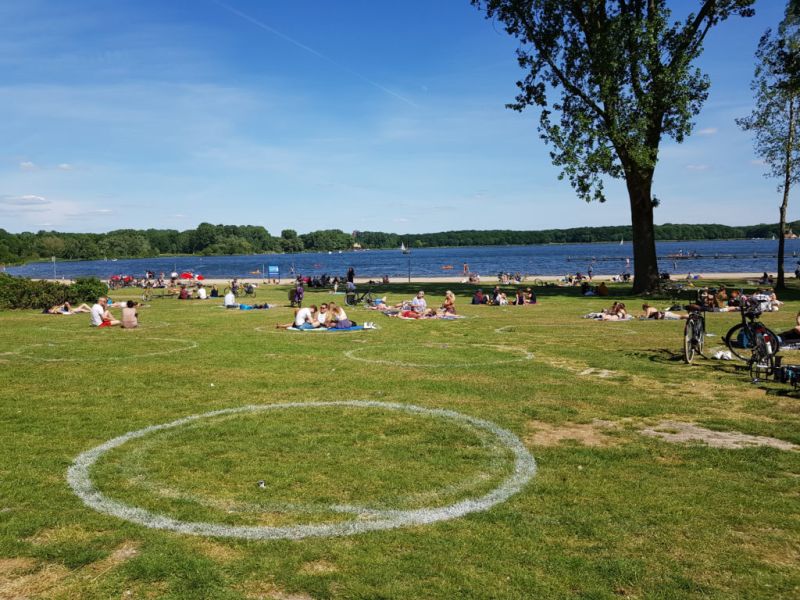
Since the beginning of this decade, something peculiar has been happening due to a combination of factors. High urban densities have made more people turn to parks and to using them differently. Cultural practices from Europe and farther abroad are being adopted, such as getting together in large groups and eating together in the park. More significantly, however, is that public space is no longer solely an outdoor entity. Public space is now digital and it’s impossible to completely shut yourself off from strangers. Your private space is now having to admit people – those you previously kept out – through algorithms, games, and Zoom meetings. As a result, the concept of private space has shifted from one of physical space to the physical body. Whenever possible we now make conscious choices in our outdoor encounters, the process being eased by the sharing economy where ‘sharing’ has gained a new economic definition that entails temporary ownership in turns. The pandemic, with its social distancing bubbles unintentionally formalizing our temporary boundaries, has accelerated how we now use public spaces as private spaces. The party and the BBQ in the park are not meant for the public around you, just as the yoga lesson, the work-out, and the dog training are not. Everyone knows that even though the teacher is standing in public space, you only participate if you have signed up or been invited. The space has shifted from public and formal to public and informal to public that is private.
Very different people with very different customs, behaviours and ideas now move freely among others in public spaces without too many issues. Imperceptibly, we have come to respect the temporary privateness of public spaces. Living Apart Together has thus entered our social realm.
This new development calls for more public spaces, which means not only parks and green squares, but also public spaces within our architecture. It calls for a new definition of the concept so that the typology of built public spaces, which has already slowly been evolving, can mature as an experience of togetherness without the burden of consumerism attached to it.
Prof. Dikkie Scipio
Q3 2021 De Architect
‘Who is the boss?’ – a column by Dikkie Scipio
Dikkie Scipio continues her quarterly columns for ‘de Architect’ magazine. Read the full essay below, focusing on the relationship between the architect and the client.
available in Dutch here
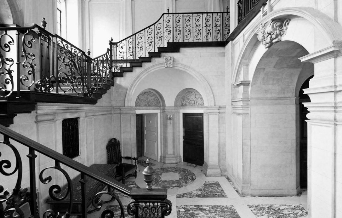
Sir Edwin Landseer Lutyens (1869 – 1944) was a British architect who built an impressive oeuvre of country houses, urban villas, public buildings and WWI memorials. One of his projects was a Neo-Classical villa (1908) for John Thomas Hemingway. A well-known anecdote is that during a site-visit with the client, Lutyens tells Hemingway that he wants to create a monumental black marble staircase. Hemingway replies that he doesn’t want a black marble staircase but an oak staircase, to which Lutyens responds: “What a pity”. At completion Hemingway beholds the monumental staircase and says with surprise: “I told you I didn’t want a black marble staircase”. And Lutyens apparently responded: “I know, and I said, ‘What a pity’, didn’t I?”.
As architects we hand these stories down with a sense of nostalgia. Those who have stood so firmly in their fight for quality, we feel, deserve their Starchitect status. We can now hardly fathom a world in which we could get away with such stubbornness. These are stories from a different era, long before the time of bulging-binder contracts, insurance claims, and lawyers. But even more so, these are stories from a time when the architect’s standing as a master builder and primary advisor to the client justified such eccentricities.
Today architects are selected primarily on the basis of compliance to detailed briefs outlining the technical, functional and spatial programme. A job is now so specified that it is immediately clear whether the client expects the architect to execute the programme as communicated, almost identically to the model in the brief, or whether the client seeks a ‘kindred spirit’ who will confirm the ideas presented and develop them further. While in Lutyens’ time architects were called upon for their experience, spatial and technical creativity, and ability to come up with an unexpected design that could surprise, amaze, and challenge, nowadays these aspects might lead to legal complications. It’s no wonder that only the most experienced firms know how to deal with this.
If we were to graft another Lutyens quote – “There will never be great architects or great architecture without great patrons” – onto our own times, then we see that our current reality is entirely different. Clients are very rarely a person. Most often they are complex organisations of investors, developers and users, represented by consultants and project managers, each with diverse political, economic and strategic interests. They do still exist, these independent individual clients with a vision and the means, land, and potential to realise a project in full freedom with an architect of their choice – but they are scarce. And I doubt whether these individuals today would accept a surprise like Lutyens’ staircase.
Perhaps it’s time to broaden the definition of who or what exactly a client is. Because: for whom do we actually build? As citizens, is it not ultimately for ourselves? Do we not have a duty as architects to build beyond the brief, or the programme as expressed legally. Just consider the quality of our public space, the quality of buildings that will be around longer than an expired depreciation period, the quality of our landscape. Or how about the benefits of developing of a long-term vision for housing and the environment we live in, or of new typologies and strategies to respond to social shifts?
There is a choice. Our profession is accustomed to having to be persuasive. Delivering more quality than requested does not require any permission or confirmation. We can continue to do this independently of our contractual obligations to the client. Even without them explicitly asking for it, without it costing them more in terms of investment and time, we are bound by our professional honour to add extra levels of quality. If great architecture can only be achieved by great patronage, then it is we as architects, urban planners and landscape architects who must step up and fulfil this role that has historically been allocated to patrons.
If it can be only one of Lutyens’ quotes that has stood the test of time, then I would choose this:
“I don’t build in order to have clients, I have clients in order to build .”
Prof. Dikkie Scipio
for De Architect
2nd quarter 2021
Translated from Dutch by Dianna Beaufort (Words On The Run)
Featured above: Hall of the Heathcote Villa in Ilkley by Sir Edwin Landseer Lutyens
‘The Art of Architecture’ – a column by Dikkie Scipio
Dikkie Scipio continues her quarterly columns for ‘de Architect’ magazine. The latest column is dedicated to Harm Tilman on the occasion of his departure from the editor position in the magazine. Read the full essay below!
available in Dutch here
Long ago I walked into the great cube – the lecture hall of the predecessor to the Rotterdam Academy of Architecture. The academy was housed in Het Blaakse Bos, the ‘forest’ of cubes designed by Piet Blom (1934-1999) spanning the Blaak boulevard. The plan also included the stubby residential tower known locally as The Pencil and the Spanish Quay, which was the element that prevented, so Piet proudly claimed later, the extension and conversion of the Mariniersweg into a ‘motorway’ straight over the Wilhelmsbridge to Rotterdam Zuid. The project was completed in 1977. Piet Blom was a committed advocate of Structuralism, a movement that turned away from the stark functionalism of CIAM after its last congress in 1959. Structuralists fiercely opposed industrialized prefab building systems and urban planning that focused on facilitating automobiles without considering urban identity, which they accused the CIAM functionalism of doing. As an alternative approach, the movement sought to assemble structures composed of smaller units that respect the human scale.
By the 1980s the once popular Social Housing department of the government was gone. And enthusiasm for both Rationalism and Structuralism extinguished. The architectural quality of prefab building systems had been reduced to naught and architectural quality within the context of civic engagement or self-build had been cast aside. In retrospect, the polarity gave us nothing in return.
Although I studied architecture and not urban planning, I rarely missed the lectures given by Harm T. His favourite subject at the time was Hilberseimer. The irony of the location is not lost.
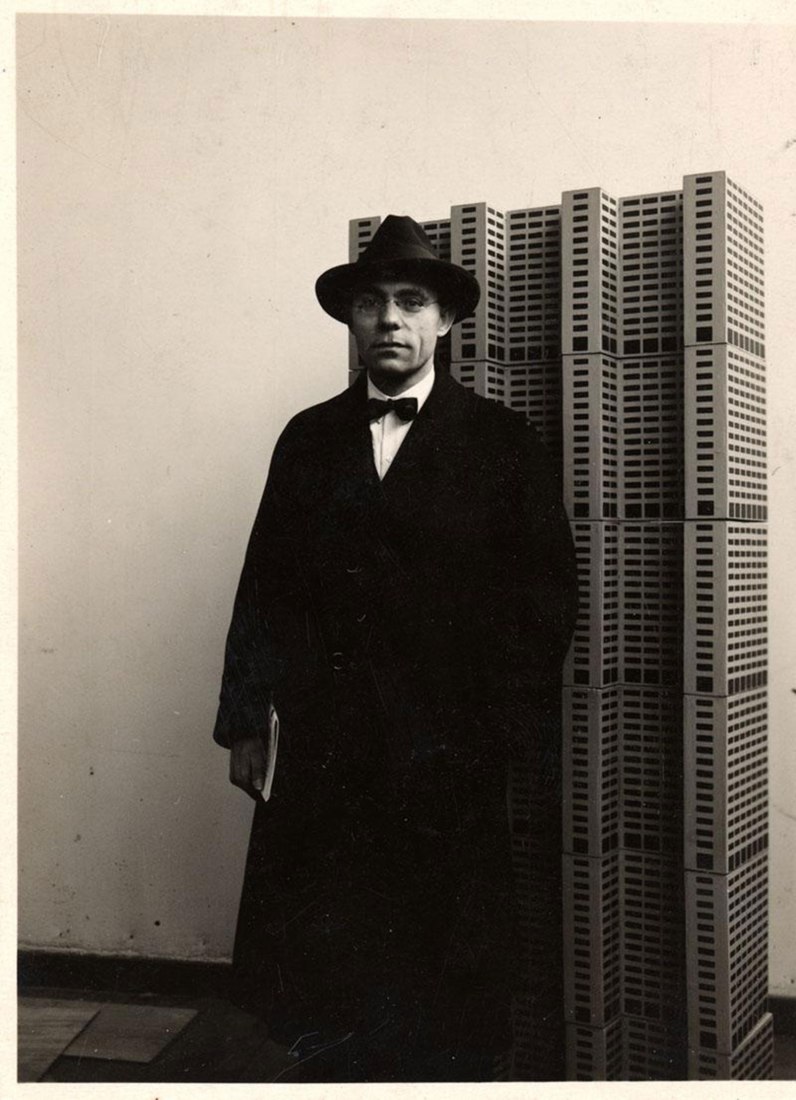
Ludwig Karl Hilberseimer
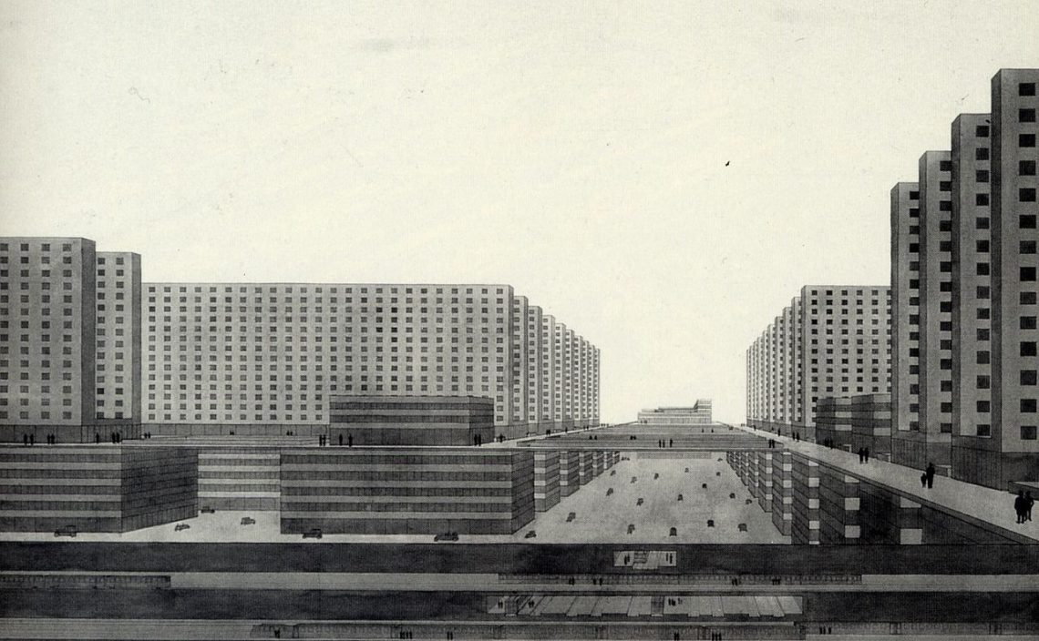
Ludwig Karl Hilberseimer (1885-1967) studied architecture at the Karlsruhe Technical University, and though he did not complete his studies, he replaced the degree with a short apprenticeship at the firm of Peter Behrens in Berlin. After this he developed into a critical thinker and writer covering topics like art, architecture and urban planning. He is exemplary of a generation of socially engaged architects and planners who were in search of better housing and a better city, to solve the urban problems that had resulted from the Industrial Revolution of the 19th century. It was 1924 – so four years before CIAM was founded – when he published his High-Rise City design, an organizational model based on the contemporary social, technological and economic context. It was presented as a vertical city in which the increasingly important automobile is separated from the pedestrian. While it was an urban planning paradigm, it was meant to serve first and foremost as a model for the architecture of a new world.
In 1929 Hilberseimer was invited to teach at the renowned Bauhaus. Here he met Ludwig Mies van der Rohe, who then left for Chicago in 1936, having been invited to head the school of architecture there: the Armour Institute of Technology (now Illinois Institute of Technology). When the Nazis labelled Hilberseimer problematic and extreme left, he decided to follow his friend to Chicago. It was 1938 and Hilberseimer was already 53.
In Chicago he developed the model for the Decentralized City. In contrast to the High-Rise City, this was a horizontal model. The biggest difference between the two was that the Vertical City was based on a concentration of production and housing, separated from the countryside which meant infinite potential expansion, while the Horizontal City was based on a closer relationship between city and countryside. Agriculture, industry and housing are satellites in the landscape and growth can occur by way of multiplication rather than spread. This model, too, was intended for the development of an architecture that suited the new conditions of urban living.
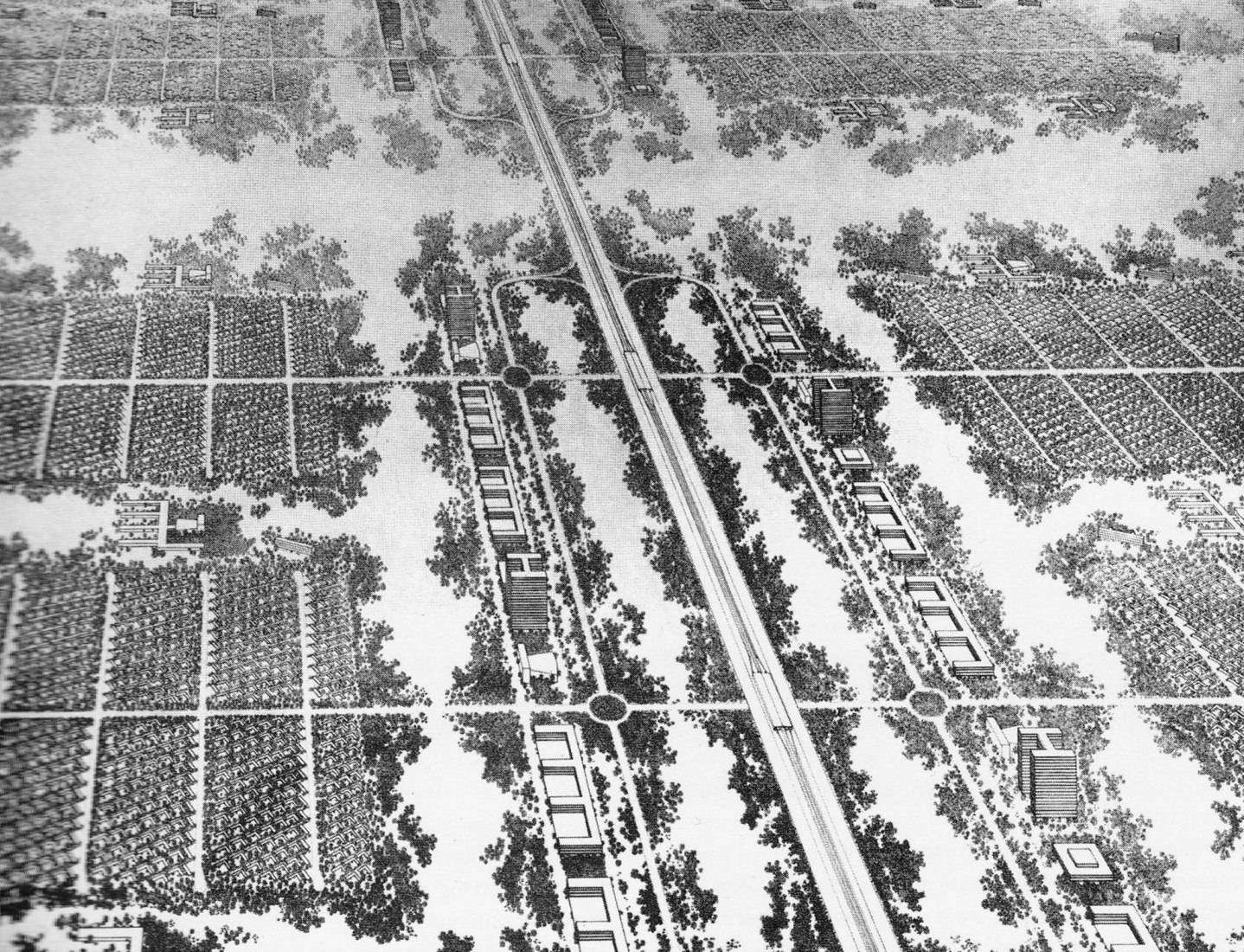
Ludwig Hilberseimer – Decentralized City
Hilberseimer’s ideas are still worth studying, certainly now that we are rethinking the city-countryside balance and revisiting social housing needs. The calls for faster and greater housing production has resulted in a renewed fascination with, on the one hand, mass industrialized prefab production, and on the other, the human scale and its translation into self-build projects. This is happening despite the fact that social housing would benefit most from architecture built on the basis of long-term quality goals. This kind of quality involves more than form or function and serves our everyday environment as a whole.
Hilberseimer’s theories strive to harmonize structure and form. What is interesting about his work, is that he always saw architecture as grounded in the sociological and technological possibilities on offer. In this he did not take a position between either form or function. Without function, without the rationale behind the architecture, a building is no more than an assembly of shapes. Without reasoned principles, architecture would merely be technical construction. Ultimately, Hilberseimer considered architecture the most sublime form of art.
I am so very grateful to Harm. Until we meet again in the next adventure!
Prof. Dikkie Scipio
for De Architect
1st quarter 2021
Dikkie Scipio talks for Manifest edition of de Architect
“I always insist on quality, quality with deep-rooted respect and appreciation for the craft.” claims Scipio in her interview for the Manifest – a special edition made by de Architect magazine addressing the major issues designers are facing today.
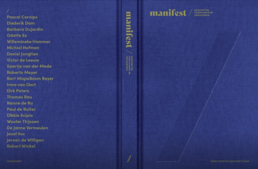
An advocate of quality, Scipio emphasizes the importance of excellent command of the profession. She claim that the basis of every lasting design should be in knowledge and expertise about how an object, or a building, is made and used, both now and in the future.
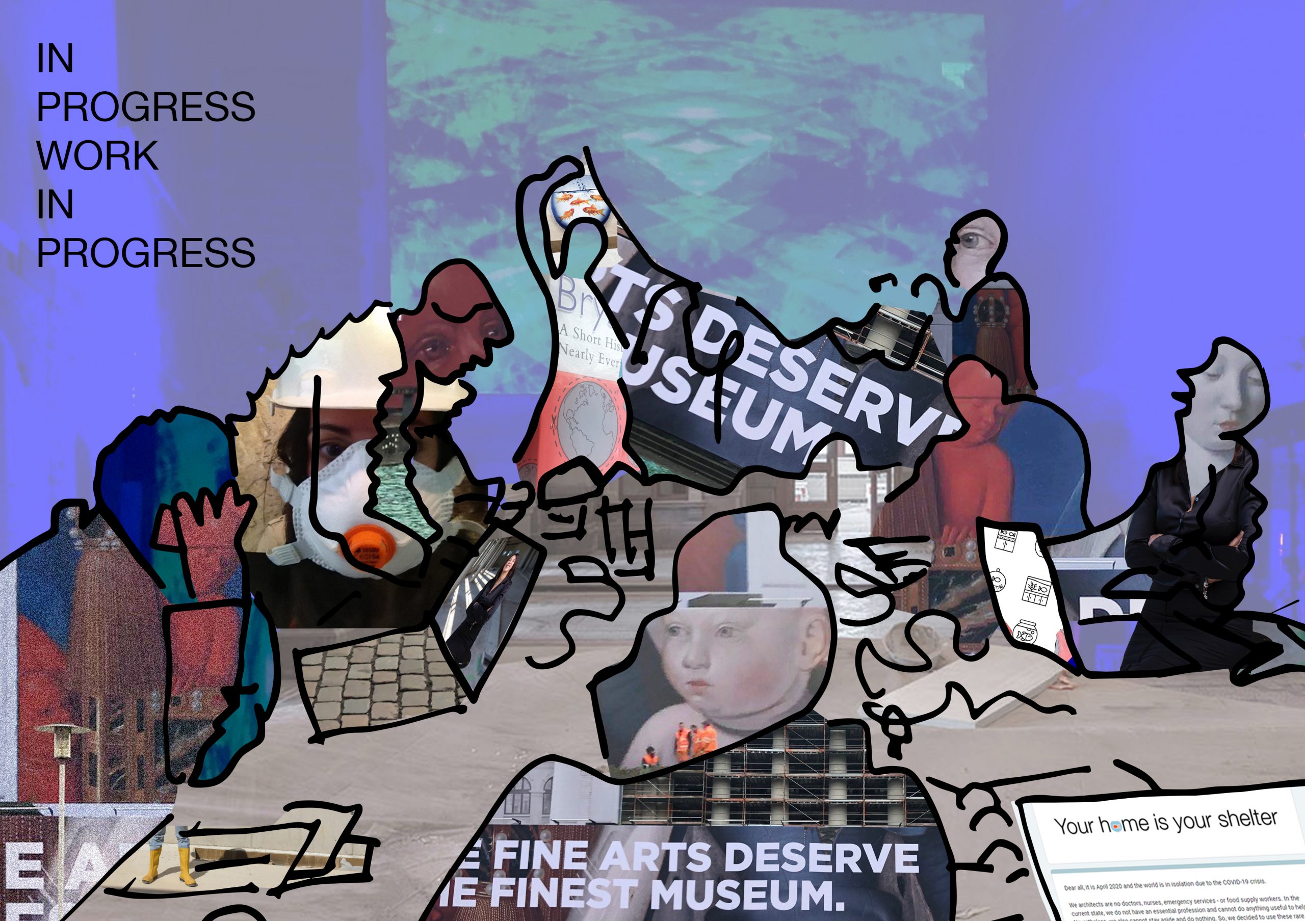
Caroline Ludwig interviews Dikkie Scipio for De Manifest
Quality, expertise and skill. This is the foundation of every design, according to Professor Dikkie Scipio, founding partner of KAAN Architecten. She calls on architects to reclaim their traditional role and calls on the government to set out a vision for the future of spatial planning.
Which projects or experiences have shaped you?
“My father and I debated endlessly. He was a cultural anthropologist and an academic thinker. Discussions often began by negotiating the definitions of the concepts that were central to the subject under discussion. Things got pretty heated. Sometimes I would have to put the discussion on hold until I had read a book to better support my arguments. My father had an unshakeable belief in the future and science. Whenever I went out to protest and stand up against some injustice, he invariably reminded me of the cyclical nature of social movements and how things always stabilized over the course of time. Now that I’m older, I can understand better what he meant. My mother, who was a seamstress, imprinted on me a love of craftsmanship and the importance of materials and the creative process.
These are two totally different backgrounds: being analytical and inquisitive, gathering knowledge and also thinking conceptually, handed down by my father, versus the diligence of mastering hand-crafted work, understanding the material, and pursuing technical skill for creativity, learned from my mother. I am always looking to fuse the intellectual process with execution skills. It is this totality that creates quality. That doesn’t mean I’m a conservative thinker with a penchant for the past; in fact, I’m truly fascinated by new ideas and techniques.”
You believe that quality should always be the primary mind-set for any architect or designer. Why is that?
“I always stress the importance of quality – quality with a deeply rooted respect for and appreciation of craftsmanship. Two aspects are key in this regard: skill and education. Craftsmanship simply means competence in the execution of a craft. Yet it isn’t just about the execution, it’s mastering the profession. It doesn’t matter whether the product is made by hand, by industrial processes or digitally. What’s important is to think through every aspect of its making and its use – its usability in the present and the future. If something is beautiful and well-crafted, it is inviting, even when it has lost its original purpose. This is equally true for a building or an object. You should create something in such a way that you fall in love with it and will want to ensure its continued use. The design should allow for this kind of scope. Unfortunately, we live in a world of short-term projects and high turnovers. There is little to no patience or appreciation for letting something ripen and grow, and I find that a real shame. It only leads to a loss of quality.
In addition to skill, I really value education, sharing expertise and telling stories. If we surround ourselves with quality, then we get used to it in the sense that we expect or demand it. Sadly, the opposite is also true – hence my heartfelt plea. Every time I undertake research I am so impressed, again and again, by the amount of knowledge we humans have accumulated. Of course, this doesn’t mean that it’s easy to find quality in the immense quantity. So the transfer of an integral form of knowledge is incredibly important, and the vehicle for this is a good story because it motivates us and speaks to the imagination. I believe the primary themes for the future are all about sharing expertise and skill. If we no longer know how and by whom something is made and we can no longer assess what quality is, then we’ve lost our foundations. The world in 2020 has pressed the re-set button, not on the basis of a vision, but out of panic. It’s essential now to make a plan, as soon as possible, to find a new balance.”
How would you define sustainability?
“The idea of circularity as the base principle of sustainability is a sympathetic one, and yet I am somewhat pessimistic about this kind of re-use as the solution to our environmental problems. Human beings are too complacent. Moreover, it may just be a side-step that serves as an excuse to maintain the high turnover rate of products. The same goes for buildings. I see sustainability as building for the long term, designing with vision, using solid materials and applying them with skill and craftsmanship.”
You lament that planning is no longer a government task and that urban area development is mostly left to the market. What do you think is a better way to drive innovation?
“At the moment we have complex, decentralized decision-making, insufficient financial and policy support, and a lack of market confidence. The market is urgently appealing to politicians for more direction, interference and structure from the national government. The market is completely capable of operating within clear boundaries, but if there are no rules or they contradict each other, then everything comes to a halt. Too much of urban or regional area developments have been left to the market. If you want to drive innovation in planning, sustainability and quality, we need intelligent frameworks and a competitive setting in which innovation is rewarded. The government could create these frameworks and make regulations consistent – regulations that not only control, but also stimulate. Then an implementation schedule can be chosen in cooperation with the market. The lack of an integrated planning vision is one of the reasons why public housing is becoming deadlocked. Right now only one job has been defined: volume – build as many new houses as possible. What’s needed is a bird’s eye view in which all the different aspects are seen: agriculture, infrastructure, housing, water management, nature conservation, etc. I believe in integrated area development, so I’m very happy with the recent parliamentary decision to establish a new planning institute, like the former Ministry of Housing, Spatial Planning and the Environment. That’s a good start for a centralized and integrated vision.”
You mention the deadlocked housing market. How do you see housing and working in the near future?
“The pandemic may well change how we live in the future, with more people working from home and in homes that are elsewhere. The whole system of where we live and work is currently based on the model of a nuclear family: two life partners with children and adults that work (full-time or part-time) outside the home. You strategically choose your place of residence based on where you work. This notion has been in the process of tipping for some time. A job for life is no longer on the cards. People have shorter relationships, shorter employment contracts, and faster mobility. All this impacts the existing infrastructure, the mobility sector and food production. It’s really interesting to think about these things. I teach at the FH Münster University of Applied Sciences and in collaboration with KAAN we carried out a survey recently called ‘Your home is your shelter’. A lot of young people from 55 different countries participated, young people confined to their homes. We are still processing the results, but we can already see that flexibility is a major issue, the ability to use a space in more than one way. Consequently, there is a need for more diversity in housing typologies, ones that respond better to what society looks like now. For example: more attuned to single people, couples without children, friends living together in separate smaller units, a desire for luxury and social cohesion. At the same time, we see that working from home means that the need to live in the conurbation of the Randstad or other big cities will diminish. And yet, young families considering moving out to the countryside face a lack of schools because centralized facilities are mostly still located in the cities. The funny thing is – remembering the ‘cyclical nature’ of things noted by my father – when I was a young girl no one wanted to live in Amsterdam. That city was the epitome of unsafe and unhygienic living; there were a lot of empty buildings. If you had said back then that the Grachtengordel [the main ring canals] offered great investment opportunities, not many people would have believed you.”
Your plea is to rehabilitate the profession of architect. What’s wrong with the current situation?
“As a profession we have allowed an increasing number of our core competencies – work traditionally undertaken by architects – to be outsourced to a whole army of consultants and managers. As a result, the architect is no longer expected to master some fundamental skills. The architect’s role is slowly being reduced to a merely aesthetic one in which aesthetics is simply a projected image. In such a case, architecture is baseless. We need to ensure that research, concept development, execution, finances and aesthetics are not further disconnected. An important part of our work is developing a vision and moulding this into viable architecture. The process, the design, the construction – foreseeing and monitoring how something is built – are essential elements of this. This is what delivers quality. The astonishing thing is that this sort of quality is not even demanded anymore, it’s often not even expected. Yet architects are trained to guide a design into full integration, to oversee and supervise this. Our profession is an enormous fount of expertise, experience and inspiration that can safeguard the long-term quality of our built environment. With only an aesthetic stamp of approval, the role of architects and their value to society is obliterated. It’s paramount to resist this. We must take responsibility and claim our place.”
Which creators and/or thinkers do you relate to?
“It’s difficult to name one great influence, so I’ll stick to people who share the characteristic of being fiercely independent in spirit. I am fascinated by people who have a great sense of wonder about the world and have made it their life’s mission to share knowledge with others, knowing they can never be totally comprehensive. Researchers and writers like Bill Bryson, who had the courage to relay a vast wealth of knowledge, put it into a timeline and produce an accessible book with A Short History of Nearly Everything. Edward Rutherfurd, who writes about the birth and life of great cities like London, Paris and New York. Francesco Carotta, who analysed the similarities between Julius Caesar and Jesus Christ. Or Oliver Sacks, the neurologist, who wrote about cases in his field as though they were novels. And artists and musicians too, those who express wonder through their art, like Miriam Makeba in her music. In her autobiography she describes how she sees herself as an ant, endowed by nature with supernatural power. I feel fortunate to be able to draw on the knowledge of a colourful and ever-expanding group of people who keep me inspired and full of wonder.”
Read more here (in Dutch). To get a copy of the Manifest visit de Architect website.
‘Quality as attitude’ – a column by Dikkie Scipio
Dikkie Scipio continues her quarterly columns for ‘de Architect’ with the newest one recently published in the June issue. Read the full essay below!
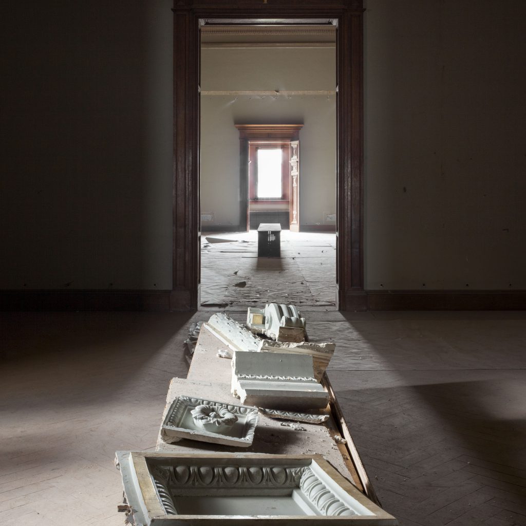
“Quality, deeply rooted in respect and appreciation for skill and craftsmanship”. This is my answer to the question what typically drives my work as an architect. I’ve been asked this question quite a lot lately, and my answer often disappoints the interviewer. They go on to comment: “Well, yes, we can assume this given the type of architecture you and your firm produce” and then they try to find a different, more interesting topic to pursue.
This has given me pause for thought. Why the dismissal? Why do we no longer recognize and, as a matter of course, value quality? Might there be something awry with the connotations of the word?
The origins of the word quality lie in the Latin qualitas, which refers to unity or capacity, or possessing a certain character. Around 1573, according to Van Dalen’s Etymological Dictionary, the meaning shifted to having a degree of soundness, the extent to which something is considered suitable for a particular purpose. Therefore, to appreciate the word quality, we must know when something is sound and when it is suited for its purpose. This is precisely the sticking point. For a very long time, architecture stood in direct relation to understanding this very thing. An end product or building needed to stand erect, serve the purpose for which it was built, and do so for as long as possible. Comfort, beauty and ornamentation were an inextricable part of the equation. No builder would entertain the idea of using materials or techniques that were merely useful in the short term unless scarcity or poverty necessitated it.
We see things differently now. Our products – and so also our buildings – are consciously made to serve a short lifespan, after which they will be replaced. The whole notion of soundness, and therefore quality, has acquired a different connotation. Durability, in the sense of being robust enough to withstand the effects of time, has ceased to be of any value. Once there is no need for making sound, quality products, craftsmanship loses its status and respect, and artisanal skill slowly vanishes. What inevitably follows is that quality is no longer a natural part of our daily environment, and then there comes a time when we no longer recognize it, other than from a picture.
Of the human senses, our eyes are the most used and most valued – and strongly connected to the culture of imagery all around the world. Dezeen and Instagram show us the most beautiful images but omit two essential aspects: materiality and context. This may seem trivial, and to some extent it is if you are used to coupling images with your memory bank of experiences. In doing this, you know that the pattern you see on the floor is called parquet; you can hear the sound of your footsteps over the floor; you can recall the smell of the wax rubbed into the wood, and you can feel the uneven patches where the floor has worn out. This tells a story, one with a history, a present and a future. Without these experiences, the picture is just a picture: it won’t help you learn to distinguish between solid parquet, laminate or even a vinyl print. Something similar happens when an image is presented in isolation and without scale. The real value in the picture is elusive without the context.
Our frame of reference evaporates when soundness and wholeness do not form an inherent part of our daily environment and when craftsmanship is not visible because it is taught and practised by fewer and fewer people. So it isn’t surprising that a word like quality is in danger of becoming meaningless. This would be a great pity because there is unbelievably more depth to the concept of quality than that found in images alone.
Let’s continue to promote sustainability as building for the long term, as an endeavour that employs solid materials, sound design and execution, skills and craftsmanship. That is not to say that we will always succeed, but let’s keep trying at least. Quality as an attitude, so to speak.
Prof. Dikkie Scipio
for De Architect
2nd Quarter, 2020
Translated from Dutch by Dianna Beaufort (Words On The Run)
Your home is your shelter – a look at living in isolation
As a professor of Architectural Design at the Münster School of Architecture, and in collaboration with KAAN Architecten, Dikkie Scipio launched a survey, focused on how current living conditions accommodate people’s activities during forced isolation.
In light of recent demands in contemporary living, our homes need to facilitate a far more different lifestyle than the one they were initially designed for. Aptly titled ‘Your home is your shelter’, the research aims to provide insight on how people use their homes, as well as how to adjust or design better ones in the future.
You are invited to participate by filling out a simple questionnaire here.
“The Profession of the Architect” – a column by Dikkie Scipio
Oscillating somewhere between art, engineering and entrepreneurship, architectural profession has always been difficult to categorise. Even within the institutions that provide architectural education, there is a systematic difference in opinion and, consequently, the focus of the curriculum.

In her latest column for Fleur Groenendijk Foundation, Dikkie Scipio explains the workings of the architecture education system in The Netherlands and how in 2015 it brought about the BEP (Professional Traineeship approved by the Register of Architects). This marked a tectonic shift in acquiring the title of ‘the architect’, impacting the career trajectories of architecture school graduates.
Promoting young architects has been a sole focus for Scipio, who is in her fifth year of serving as a board member of Fleur Groenendijk Foundation. In an interview earlier this year, she explained that aside from graduating with top marks, the success of every young architect relies heavily on being recognised and embraced by potential customers or employers. To that effect, with initiatives like De Meester, she seeks to highlight the work of recent graduates that shows social and contextual relevance, craftsmanship, and a clear vision.
Read the entire column here (English, Dutch).
‘Stations as Nodes’ book is out now!
Led and coordinated by the Chair of Complex Projects, Faculty of Architecture and the Built Environment TU Delft and the Amsterdam Institute for Advanced Metropolitan Solutions, ‘Stations as Nodes’ explores the role of stations in future metropolitan areas from both French and Dutch perspective.
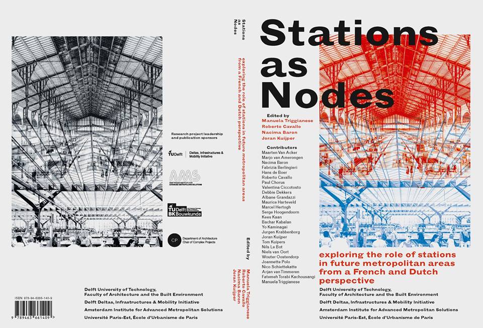
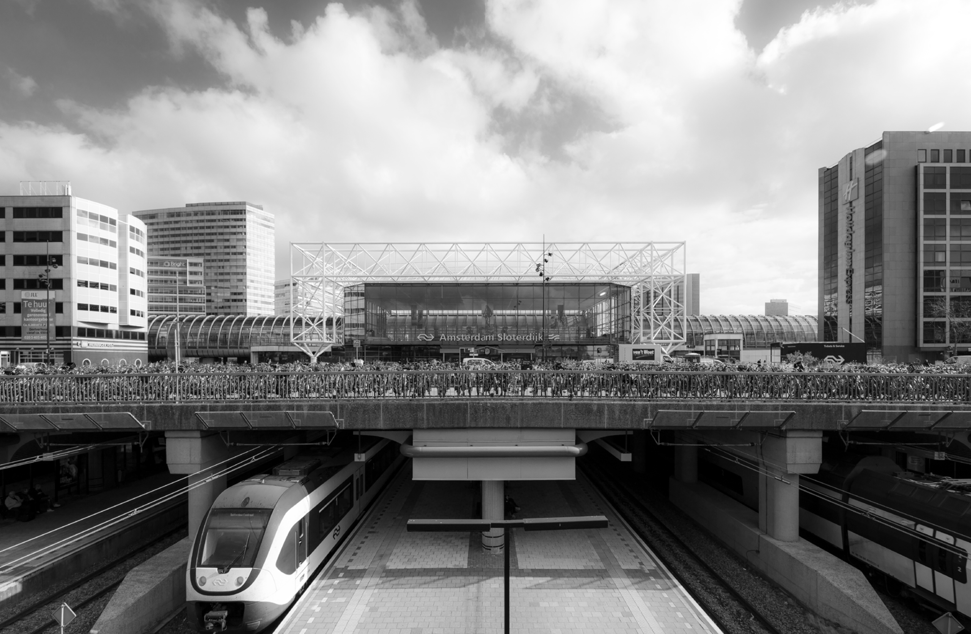
Summarizing the activities currently running at AMS Institute, Delft University of Technology and University of Paris-Est, the book presents Stations of the Future initiatives and the Integrated Mobility Challenges in Future Metropolitan Areas summer school, accompanied by a curated reportage of the Amsterdam Sloterdijk station area by Sebastian van Damme.
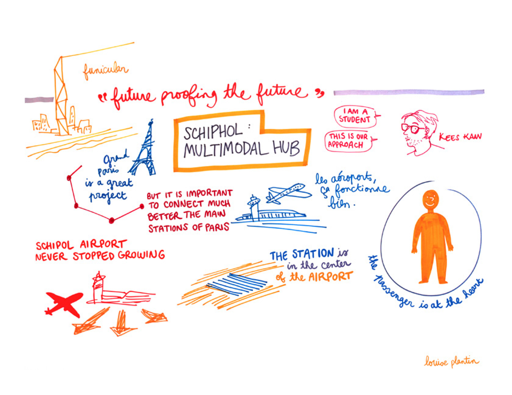
The book also features contributions by invited experts on specific aspects and problems of conception, management and development of stations. Included as a ‘project from practice’ is Kees Kaan’s essay about the Amsterdam Airport Schiphol Terminal designed by KAAN Architecten. Other Dutch contributions include Benthem Crouwel Architects and UN Studio.
Find more information about the book here, or visit BK Books to download the e-book copy.
‘Non-Super Dutch’ – WA magazine issue curated by Kees Kaan
In order to present the exciting new currents of Dutch architecture, Chinese magazine World Architecture (WA) has invited Kees Kaan to curate the issue aptly titled ‘Non-Super Dutch’.
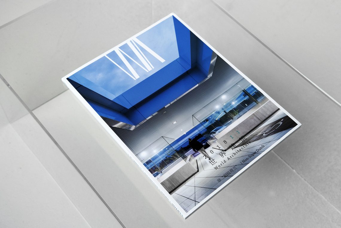
In his opening statement, Kees Kaan elaborates on the contemporary developments in Dutch building culture: “The Netherlands has an ideal culture for conventional architecture. The cultural consensus here leaves no room for the unbridled creativity of a genius. Property development has been regulated in such a way that all parties involved or tangential to the process have a right to voice their interests or concerns.” By default, this has influenced the role of the architect within that process, making it a role of inspiration, storytelling, conception and management. “Architects have relinquished control as master builders and are not the sole authority on how to build, but are now professional advisors in teams of interested parties,” says Kaan.
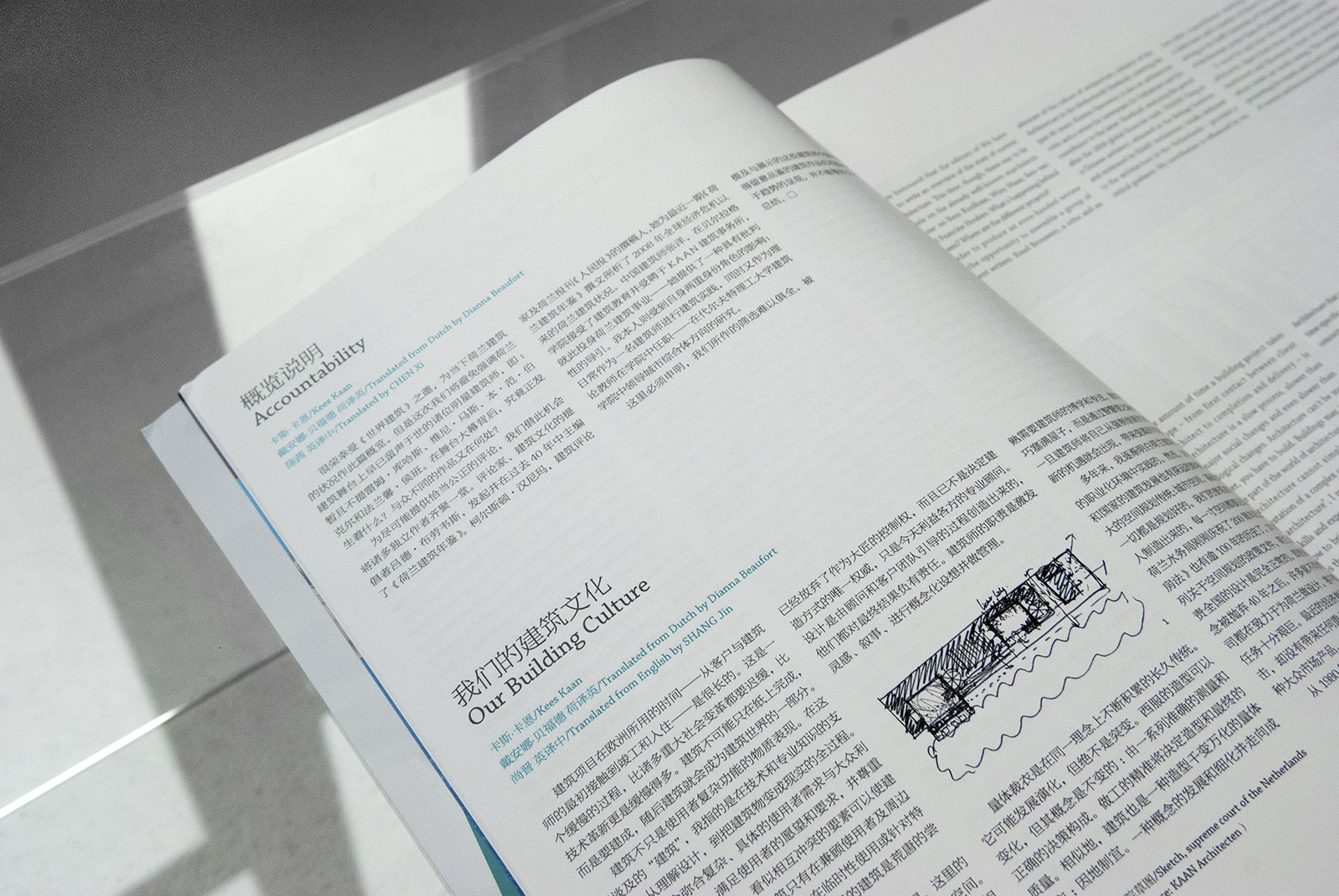
Along with Kaan, a group of independent writers – such as Ruud Brouwers, Kirsten Hannema and Yang Zhang, have contributed to revising the iconic, yet outdated notion of ‘Super Dutch’. Moreover, the issue includes a project selection which is completely arbitrary, in order to showcase a diverse range programs and typologies in recent architectural production.
Read the full opening statement here.
Dikkie Scipio on creating a platform for young architects
‘Young people with fresh new ideas are the lifeblood of our office’ claims KAAN Architecten founding partner Dikkie Scipio in her latest interview for the Fleur Groenendijk Foundation where she serves as a board member. Right at the heels of announcing the new De Meester winner for 2018, this rings true more than ever.
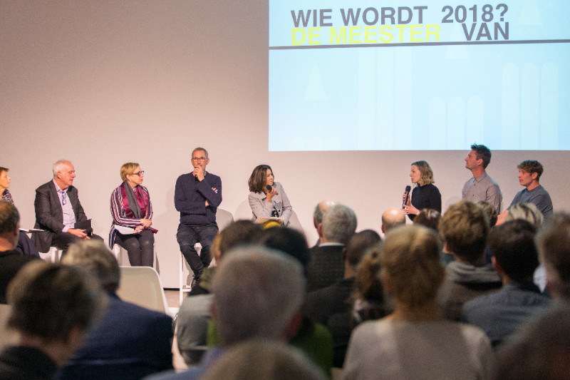
Graduating with top marks aside, the success of every young architect relies heavily on being recognized and embraced by potential customers or employers, explains Scipio. This is why De Meester award was created – to give young graduates a platform to present themselves to larger audiences and make a debut within the professional sphere. Along with a jury of industry professionals, she seeks to highlight the work of recent graduates that shows social and contextual relevance, craftsmanship, and a clear vision.
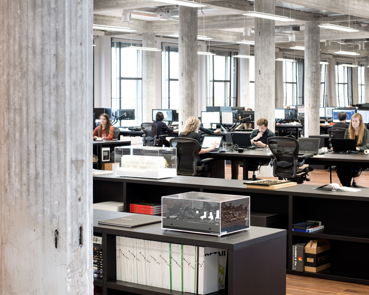
Same rules apply within the office, where combination of experienced and young architects meet in a dialogue that is essential for the design process. In her own words: ‘This is the start of the dialogue that you hope will lead to something better, something that you could not have thought of beforehand.’
Read the full interview here. (Dutch only)
‘Thank the crisis’ – column by Dikkie Scipio
Dikkie Scipio’s new quarterly column for Fleur Groenendijk foundation has been published.
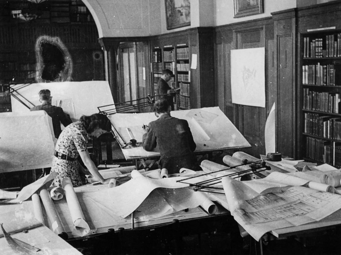
In her latest column written as a board member of Fleur Groenendijk Foundation, Dikkie Scipio reflects on the implicit advantages for societies and economies that occur during troubling times. The essay elaborates on how unexpected debates and initiatives develop when different actors are brought together by extraordinary circumstances. At the same time, it also advocates keeping up that positive momentum even after the times of crisis have passed, in order to keep benefiting the larger community.
Read the full article here.
‘Beauty does not judge’ – new column by Dikkie Scipio
“Stripped of its culpability or glory, what remains is the proof of craftsmanship by architects, artists and builders. Beauty does not judge.”
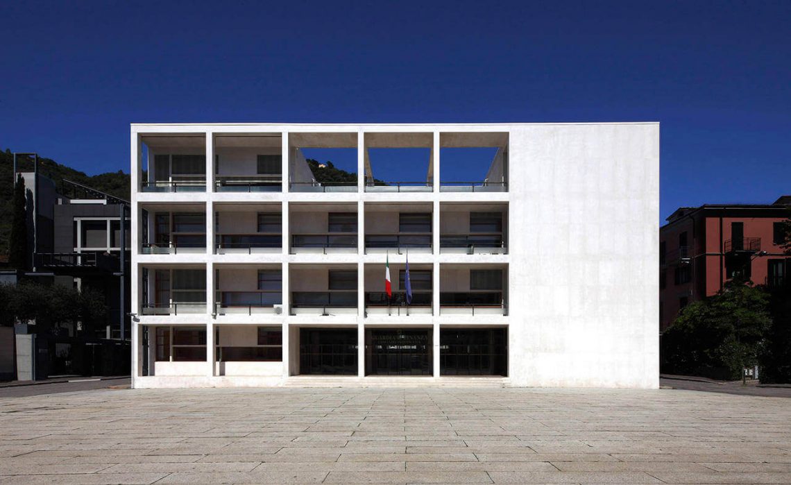
Continuing her work as a board member of the Fleur Groenendijk Foundation, Dikkie Scipio writes quarterly columns in response to the incoming funding applications. Her most recent column reacts to this quarter’s application ‘Controversial Heritage’ by Ankie Petersen. Aptly named ‘Beauty does not judge’, the essay discusses how we deal with politically charged heritage, and can we separate the valuable architectural and artistic opus from the regime that brought it about.
Read more here!
speech: magazine (Russia) interviews Kees Kaan
Kees Kaan has been interviewed by Anna Martovitskaya for the nineteenth issue of the architectural magazine speech: which explores the theme of regulations. Read below the full text.
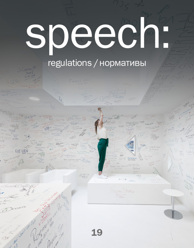
Anna Martovitskaya: The theme of this issue of our magazine is rules and regulatory standards. I’m sure that as an architect working in many countries — and on projects of a great variety of different types — you must find this subject very relevant. I would like to begin with a fairly general question: in your opinion, do regulatory standards and rules kill creative freedom or, on the contrary, do they help architects create buildings?
Kees Kaan: I would say both are the case. Regulatory standards are an ambivalent phenomenon. There are standards and rules which really do kill a project — they reduce it to faceless greyness; but there are also those which stimulate creativity and innovation. And, of course, a great deal depends on which country you’re working in. In France, for instance, the standards are very strict and regulate the greater part of building volumes under construction. For example, they prescribe very rigidly what the distance should be between buildings based on the angel of daylight exposure. In the Netherlands, on the other hand, the authorities have gradually come around to introducing performance standards rather than restrictive ones. Which is to say that we architects no longer hear “such and such is not allowed”, but “if you do this, you must ensure that there is so much daylight, such and such fire-safety protection, and so much energy consumption”. The architect has to prove that his design meets certain performance standards. You have to admit that this is a completely different way of setting standards.
AM And which of the two approaches seems best to you as an architect?
KK Personally, of course, I find it more interesting to work with performance standards. I can’t say I find it simpler, no. It’s probably simpler to work with prohibitory standards: you take into account all the necessary prohibitions, end up with a result, and then calmly set about building it. Often, of course, you’re kicking yourself thinking about what you could have done, including with regard to aesthetic design, but were not allowed to do, to make the project richer. As for performance standards, on the contrary, they compel you to be highly inventive so as to get the results you need. Of course, this means more work for the engineers. But, you know, for me it’s very important that there is always a chance to go to the municipal authorities, explain the gist of your proposal, and be heard. If you can prove that the city will be improved by a particular building being built with certain deviations from the standards, you should be allowed to do it.
AM Since you’ve started talking about different approaches to regulation in different countries, I can’t not ask about Brazil, where your firm also has an active presence. What is the situation there with regulatory standards?
KK It’s a completely different world there. Of course, Brazil does have regulatory standards and they’re mainly prohibitory ones, but it’s also common there to simply ignore all kinds of things. And they often build quicker than we sketch, so… I’ll put it this way, we can’t always manage to get our sketches to match what is being done on the construction site. But we haven’t lost hope of eventually getting a better grasp of the local specifics — given that at the end of the day regulatory standards are a reflection of the national identity and the building culture of a particular country, and this code needs to be studied long and attentively.
AM Do you take on local partners in each country so as to improve your understanding of the local regulations?
KK Yes, of course. Local partners are essential. Although the character of the interaction with the firms assisting on a project may gradually change quite substantially. For instance, in France, — after completing several projects, — we already feel ourselves to be about 80% independent of our local partners, and in Belgium the degree of freedom is even higher. But in Germany, on the contrary, it’s impossible to do anything without a good local partner.
AM Do you think that in the context of global urbanization regulations should gradually become increasingly universal?
KK Only those standards and rules which concern our existence on the planet in general. If each of us does not make an effort to prepare the planet to accommodate 10 billion people, then nothing’s going to work out. Which is to say that as far as concerns energy saving and treatment of resources, I would probably be in favour of a certain unification of the rules. But in the case of regulations of a more local kind which concern the culture of building in a particular place, it’s unlikely, of course, that they should be treated in identical fashion. Standards are also a way to impart legal stability to development projects. This is very important from the point of view of economics too: people need to be sure that they will recoup the money which they’re investing. If the rules and standards do not suit the given culture, then people won’t comply with them and that means there can be no guarantees.
AM One of your best-known realized projects is the reconstruction of the Central Post building in Rotterdam, which is now the most ecologically sustainable listed building in the Netherlands. Was attaining such high results a matter of what you wanted, or did it follow from the regulations?
KK I would say that in the present case there was a happy match between the building’s basic capabilities and the ambitions of the client. This is a 1950s building which was originally used for sorting mail. We turned it into a mixed-use office complex for the creative industries. Without changing the building’s external appearance, we increased the number of storeys and doubled the usable floor area. The smart lighting and ventilation, the cooling ceilings, and the double-skin facade, which lets in lots of daylight, make the building a record-beater in terms of ecological sustainability. So in this project maximization of profits went hand in hand with maximization of ecological sustainability. That is not always the case; this particular project was lucky. And for that we have the client to thank, of course: all the decisions — including with regard to the cooling, the ceilings, and the lighting — were taken from the point of view of financial optimization.
AM You have created buildings of all types — educational institutions, administrative buildings, cultural buildings, and housing. Is there a building type which you haven’t worked with due to the rules and regulations being too strict?
KK I don’t think so…. I wouldn’t want to build a prison, but that’s more for personal reasons. I would find it oppressive. Although, on the other hand, we did design some court buildings containing a block of cells — but cells where prisoners are kept for one day only. From the point of view of the dictate of regulations, building type is not that important: the most pressing issues arise when you begin to tie a building’s functional program to its architecture and neighborhood in the city. And for us this is always the most important question — how the structure interacts with the site on which it stands. The design efforts are focused on finding a solution where we find a layout and a program for a building which allow us to fit it perfectly to its surroundings and to impart new qualities to the latter. Strictly speaking, it is for the sake of such moments that we do all our work — to find the best way that the new and the existing, the private and the public, can engage with one another and to come up with ideas that make the city a better place to live.
AM To what extent, do you think, are experience and broad competence important in this process?
KK Competences are important, but you have to understand that additional competences can always be acquired — for instance, by hiring the appropriate specialist, perhaps someone who knows a particular building type or the specific regulatory standards, to work in your team. For example, we won the competition to design the Netherlands Supreme Court without having any experience of designing court buildings. And although there was undoubtedly an element of luck in this, I am sure that the secret of our success was that we are able to listen in an unbiased way, be open-minded, and understand the real needs of the given city and society, the needs that lie behind the specific competition brief.
WA magazine (China) on Complex Projects
Interview by TIAN Ni – WA magazine (China), 326 issue, 08 2017
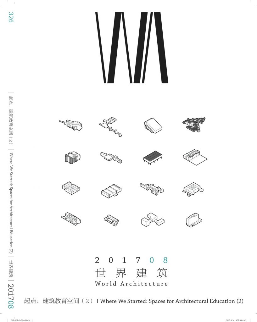
In relation to the background of the Faculty of Architecture and the Built Environment at Delft University of Technology, World Architecture interviewed the Chair of the Complex Project (2006-present), professor Kees Kaan.
WA: World Architecture is going to publish an issue on “Space for Architectural Teaching” exploring the relationship between teaching space and architectural education. Can you please let our audience know more about the Faculty of architecture at Delft? And something about “BK City”?
Kees Kaan (KK): The faculty members of architecture at Delft come from many departments, so it’s not just an architecture school focusing on designing buildings exclusively, it’s called the Faculty of Architecture and the Built Environment, so it looks at a wider scope of everything related to the making of our environment, including urban planning, real estate management, building technology, heritage, restoration renovation, and of course architecture. And all these different departments are combined into one faculty and they all use that building called “BK City”. It is called BK City because it functions like a city. It is a place with many, different cultures or subcultures inside it, like people from different neighborhoods, with different attentions, and different interests.
So before BK City was there, the architectural faculty consisted of the same group of people. They were housed in a totally different building that was built in the 1960s designed by Jaap Bakema and Johannes van den Broek, two very important Dutch architects, and it was a building with a highrise tower, but it burned down in 2008. That building was a very well articulated architectural project, specifically designed to be an architectural faculty. After the fire, that destroyed the entire building, the faculty was provisionally housed in tents. It changed the faculty from being vertically organized to the horizontal layout of the tents.
It is totally different spatial experience that changed entirely the way people collaborated and started to work, because in the building with the vertical system, with elevators and staircases, most of the meet and greet happened only on the ground floor. After a coffeebreak or a lunch we had move up to disappear into our own individual space to sit there and work. There was not so much informal interaction between people, between different faculty members. Interactions between students and professors etc. were even less because professors and teachers had their own rooms and they could simply go into their rooms closing the door. In the tents this was not possible because there were no doors and we had no rooms, so everybody was in one big space and everything was provisionally, and that created a very informal atmosphere of exchange of knowledge and information, and meeting each other. Of course it was a bit more difficult to concentrate into work and the comfort was rather moderate. Then finally the university decided to put the faculty of architecture – which is a very large faculty actually, we are about three thousand people there – to put it in an old building they actually we’re just intending to sell but with the fire they stopped it at the last moment.
It was an old chemistry building that is now turned into BK City, and that old building became our new home. I like this building which stretches out as a long horizontal surface with different wings and courtyards, and two of the big courtyards were covered with a big glass roof. One of those courtyards became the orange room, where students work, where lecture and events are organized and that has become the emblematic space of the faculty. It’s always a bit noisy, but it is very dynamic too.
The other big courtyard became the model room, big machines are placed and many students can make models simultaneously, and the rest of the building most renovated in very fast quick way, very provisional, to make it possible for the active faculty to move in within two or three months, that happens, and it was the best thing that ever happened to the school of architecture at Delft. Since that moment communication between people of the school became more informal and more frequent.
The ambience became much better, big spaces for exchange, big floor plates, and also because of this somehow provisional character. Things were not perfect and that was exactly right. It was of course a shock. The fire shook up the whole population of BK City. Professors like me, we don’t have our own private rooms, I don’t even have my own desk. I am working everyday from my laptop. I do have a room for my chair where did my team can work together, but I don’t have my individual desk, the disadvantages maybe that you’re sometimes difficult to find, but the advantage is you work in a much more open and informal ambience, no treshholds. So I think, this is what happened to the architecture faculty in the Netherlands: fire, the tents, the new building, the provisional renovation and the way it is used. The faculty was taken out of its comfort zone entirely, and then had to work with what was available at short notice. Not everything is perfect, and it’s impossible to get the perfect. I hope gradually we will improve the building to make acoustics better in certain rooms and things are being improved, but this sort of level of inconvenience and the necessity to work with what you have, created a very strong, good collaborative spirit that improves the way people exchange knowledge and information, and so to improve education.
WA: In your opinion, what are the connections between architectural space and teaching?
KK: Well yes there is important connection, because we have experienced with the shift it made a huge impact.
It has shaken the institutional aspect of teaching. Louis Kahn said: for teaching, what you need is a place where you sit under the tree, you make a circle together and you have a teaching situation, teacher and students under a tree. To a certain extent that is true, so teaching is possible under very different conditions, but it always happens among people. Teaching is about the exchange of knowledge and information. When there is a necessity to organize teaching at larger scale, to institutionalize it, then the question of the type of facilities you need becomes relevant. Say how many trees you need with people under it, and how many big trees and small trees or big rooms or small rooms and how many meeting places, and also, so what kind of settlement or layout to make, for the institute to function. So for teaching, not with standing studio or seminar or big lectures or informal discussions, you need students to feel comfortable, and you prefer the students to work at the school rather than them staying at home, so you want them to come to the building and do their work there.
So the building has to provide a large scale of different facilities in different places, for the students to feel connected, to feel that they want to be there, so I don’t have the sort of recipe for an ideal teaching space. It is such a complex question, but I think that, the bottom line is exchange and meeting, and I think that is super important for a pleasure place of education.
WA: How about the mixed functions of the review space or the exhibition space?
KK: I think the most of the spaces have relatively dedicated character, for example, the model room is mostly used for models.
WA: But sometimes, the presentation and exhibition can happen in the same time and same place.
KK: Well, I would say it’s not so easy that we mix in BK City two difference things. There would be a larger exhibition space for graduation exhibitions, so that at events we do very often or sometimes we have to do that object. The other thing is the store, because our students doing the models, and we have to storage them now and then, because the classrooms have to be empty and clean, studio spaces have to be empty for new studios and then we want to keep the models for presentation, at the end of three semesters I want to make an exhibition but two storage is the work of the students, that’s really problematic, we simply don’t have this place for that so that it’s still a problem. I think it is important also to consider both exhibition and storage.
WA: So you mean in terms of usage, it’s more like leaving the place to be occupied, and then we discover our function and reinterpreted with this place?
KK: I think it depends on density. I do think we have pressure, and cannot use the place with flexibility. It automatically occurs, especially when a high pressure on the space exists. That’s not only in an educational facility but also happens in cities already, so when there’s a lot of pressure on the usage, people become automatically creative, tolerant and flexible. In BK we have a very high pressure. We have a huge facility, but still it always fully filled and crammed and it’s really very intensely used, of course there are also very quiet moments, but that has to do with the system of education. All the programs are sort of running in parallels, so everybody has his presentations in the same weeks, everything runs in parallel, so there are very quiet weeks, and then there are the weeks that you need three times the building. In that sense, it would be more practical not to run everything in parallel, because you have this academic calendar, a very strong demarcation of semesters and quarters, periods for exams, so you always have the peaks of use of the building. It is complicate.
WA: After fire, what happened to the original building?
KK: It was not a little fire. The fire completely and totally burned down the building and it disappeared entirely. So it was really collapsed, after that, there was nothing left but ashes, so that’s why we went to the other building, originally with the intention as a temporary place, and then to build a new building. That temporary solution turned out to be okay, let’s us simply stay there.
WA: As we know, a part of the areas was designed by MVRDV, what do you think about it?
KK: I like it very much, it’s very nice places. It’s one of the courtyards that they made the lecture facilities in it, the orange stairs, and I think it’s very nice, at the stairs students can sit and hang around. Sometimes lectures take place there, and it works as one of the central spaces in the building.
WA: In BK City, which part of the building is most popular for the students? How about the users’ feedback?
KK: I’m not sure, because I never interviewed the students. There are different rooms that are very much liked, but it seems they do like the cafe outside, especially on sunny days, it can be very crowded there. So there’s really a hot spot as you can say, also the espresso bar is really a meeting point, it’s very much liked. I think the students also like very much the model room, it’s a very good place, it’s very big spectacle, and it’s nice to work there and see all the models and see different students at work. The orange room, I think, is also much liked, and also much appreciated, because there is a very strong character, it’s sort of a icon for the BK City. You could say it is one of the wonderful places that is photographed a lot, but then there are also educational areas like those in the east wing, the ground floor space which is a very big nice studio, and you can work with at least hundred students, it’s super nice and fantastic.
(Proofread by LIU Yishi)
“Relaxed dignity” by Kees Kaan on OverHolland 18/19
KAAN Architecten designs new building for Tilburg University
(article originally published on OverHolland 18/19, 2017)
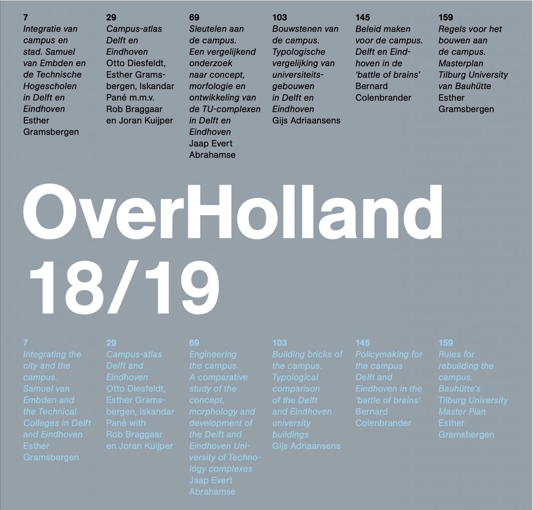
‘KAAN Architecten and the building firm VORM are together creating a large new building on the Tilburg University campus. With 11,000 square metres of floor area, the university’s Teaching and Self-Study Centre (OZC) is intended to offer students better facilities and hence further improve the quality of education. The building will have BREEAM (Building Research Establishment Environmental Assessment Method) ‘Excellent’ certification, the maximum achievable level of sustain- ability. Completion is scheduled for autumn 2017.
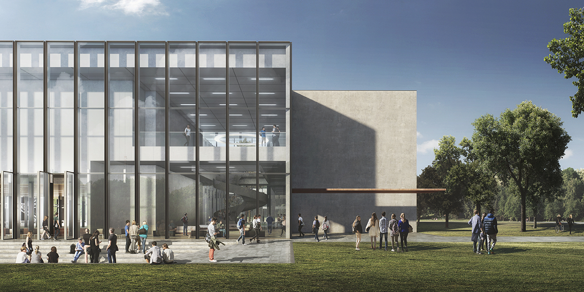
The KAAN Architecten design shows an OZC that is square and fairly low, like various other buildings on the campus. This means it will fit in well among the trees and the other buildings. Yet it is substantially different from the square central Cobbenhagen building, the former Catholic College of Economics that formed the basis for the university back in the early 1960s. Whereas with its two courtyards the enclosed structure by architect Jos Bedaux (1910-1989) brought the landscape inside the building, KAAN Architecten’s centre will blend into it. Abundant daylight and radical perspectives will allow the building and its surroundings to merge. The study areas will be enclosed in the same way as a woodland clearing.
The OZC, which will serve all the university faculties, will be constantly full of people – up to 2,500 closely connected students and teachers. To maintain the open character of the building and avoid any sense of crowding, the centre will be spacious. Like all its areas, its corridors will be wide, light and up to 6 metres in height. The programme includes a large number of study and group areas, large and small, as well as a variety of lecture halls, all equipped with the latest communication facilities. To keep the building transparent, the centrally located auditorium is sunken.’
This was the text of the press release on the build- ing after the contract was awarded. This article will look at the project in greater detail: what were the ideas and arguments behind our design?
Relaxed dignity
Cobbenhagen, master plan, perception of space, Bedaux, dimensioning, verification and validation – none of this means much to the average student on the campus. When designing things, we archi- tects try to look through everyday users’ eyes. Of course, we bear in mind that these are not just today’s students and teachers, but also future generations, and we also realize that this building must be part of a set of buildings on a magnificent campus with a robust architectural tradition.
To students, the P, W and C buildings are places where they study at Tilburg University, and which they are not particularly critical of, but not particularly enthusiastic about either. But they love the new Teaching and Self-Study Centre. Nice and open, easy to find, and the sunken seating area is ‘chill’. They don’t use terms like ‘transparent’, ‘green landscaping’ or ‘logical routing’. As everyday users of the building, they simply think about what it’s like to walk to the building and attend lectures or seminars there.
When our students arrive at the campus, they mainly have a sense of pride about being able to study in such a fine place with its interna- tional air. All the greenery makes them feel as if they’re still on holiday abroad. The shrubbery is neatly pruned, the grass is mown. The gardeners are busy keeping the parkland tidy and smart. The first impression is one of fine buildings and green space. So easy to find your way around – everything’s where you expect it to be. As they walk to the OZC, students think how glad they are to have chosen to study in Tilburg.
Of course we also walked round the campus and saw the same thing with different eyes. What we saw was a compact greenfield campus with archi- tecturally high-quality, well landscaped buildings.
When you see the campus layout, it makes sense for the Cobbenhagen building to have a counterpart. The OZC site is destined for a building of campus-wide importance, just like Cobbenhagen. Both buildings have a prestigious appearance, and both are used by all the students and university staff, from every faculty. Cobbenhagen above all provides ceremonial facilities, whereas the OZC is there for day-to-day teaching activities.
The relaxed dignity of the Cobbenhagen building was the model for a contemporary response, the design for the OZC – a building combining the same dignity with relaxed user- friendliness. The OZC occupies a key position in relation to the existing buildings, and so contributes to a balanced whole. The design will give the north-western section of the campus the required architectural and landscape value.
Urban setting
The composition of the campus is marked by detached buildings that are freely and orthogonally located in space and are not aligned. The OZC is part of this spatial interplay. Its similar positioning, proportions and use of materials creates a dialogue between it and the Cobbenhagen building on the south side of the campus. Whereas the centre of the campus is marked by densified building along the main axis, the Esplanade, the Cobbenhagen and OZC buildings are more freely sited in space. The construction of the OZC will result in a balanced campus structure in which the OZC is part of the interplay of open, overlapping urban-planning spaces and unob- structed perspectives. We have also taken account of the spatial substructure, in which the route from the railway station plays a key part.
In the southern section the Cobbenhagen building stands free in a green cocoon fringed by trees. The northern section, formerly (and for good reason) nicknamed ‘the Wood’, will now have a similar character. We have enhanced the existing row of trees, the building stands free in space, and the landscape abuts directly on the building, further emphasizing the park-like character of the campus.
The design of the campus is mainly geared to use by pedestrians and cyclists. The green space to the south of the OZC therefore has winding footpaths and a fountain on a lawn. The building is anchored in the overall landscape by the orthogonal paved paths leading to the entrances and by the sunken terrace on the south side of the building.
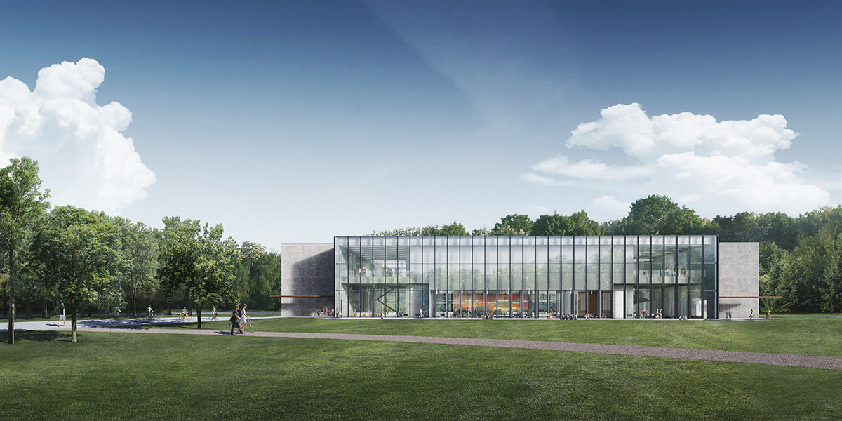
The building presents itself as more or less equal on all sides; the façades vary in openness, but are never perceived as closed or as rear sides. The east and west façades have the most sunlight in the mornings and evenings, and therefore have a more closed design. The north façade is very transparent, and lets the pleasant northern light in. The south façade, which receives a lot of sun, does not contain areas where people spend time, and so it can be completely transparent.
The logistically well-situated entrances on the south-east and south-west sides in the closed corners link the building to natural pedestrian routes on the campus. This siting frees up the south façade, and the OZC presents itself to the campus with the transparent auditorium and the study plaza to the rear.
Building typology
Dialogue with Cobbenhagen is also pursued in the design of the building. For an optimum relationship with the surroundings, we have eliminated any programme from parts of the façade, particularly on the south side. This choice has logically led to a patio building, for the patios ensure there is enough façade length to facilitate the complete programme of rooms. The sunken auditorium allows the building to be kept to just two storeys. The outlines, height and type are ultimately similar to Cobbenhagen, but the atmosphere and use are clearly geared to study activities.
We see the Cobbenhagen building as the flagship of the campus, the place where its DNA is in a sense stored. This is why we started by taking a close look at it. At first we literally attempted to make a copy of it, but with the OZC programme. Although this proved a good way to discover the qualities of the building, we saw that it was impossible to achieve the same spatiality with the chosen OZC programme within the Cobbenhagen outlines. The gross/net relations and the type of programme in Cobbenhagen were entirely different, with the main focus on prestige and ceremony. Yet the study greatly helped us to grasp the essence of the OZC and to assemble arguments that would make clear to the client why it should be a different kind of building.
The resulting insight into the spatial quality of the Cobbenhagen building and the study of OZC programme led us to a self-evident design which we then implemented: a building with two patios, with the lecture halls organized on the façade and the large programme sections in the centre.
Exact siting
The final site of the building is determined by the distance from the surrounding buildings and the existing trees. Dialogue with the landscaping of the Cobbenhagen building requires some distance from the surrounding green space. Shifting the building as far north as possible has created more open space in front of the south façade and a maximum continuous area for parking. The transition from the façade to the green cocoon is almost seamless; the omnidirectional building is right in the middle of the grassy landscape, fringed on three sides by trees. The wind-sown pines in the patios are a reference to the trees in De Oude Warande.
The building marks the end of the north flank of the campus. The south façade is oriented towards the main axis of the campus. This façade is completely transparent, providing a view into the heart of the building – the study plaza. The indoor and outdoor areas appear to merge.
Perception of space
Perception of space in the building is determined by proportion, materials and light. It is greatly enhanced by the clear spatial structure, the proportions of the rooms and corridors, the materials used and the amount of daylight let into the building.
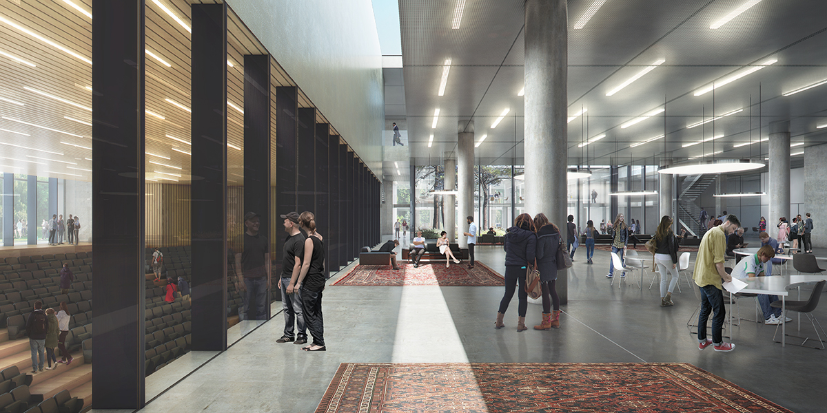
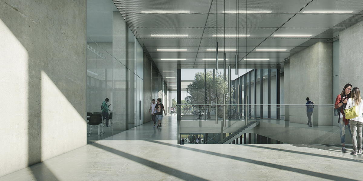
The ample dimensions have allowed the programme to be fitted easily into the building. The ground floor is inviting, and the height makes it feel like a truly public space. Together with the size of the study plaza, the patios, the outsize spaces and the transparency of the auditorium, this has created a generous building. The ground floor in fact forms a single landscape in which open study areas, lounge areas, traffic space and a restaurant alternate. Study and relaxation blend together in the heart of the building, where the study programme and multifunctional traffic space merge into a single vital space. The study plaza allows all kinds of different uses. With its transparency, the auditorium is part of this vitality. There is a direct sightline from the study plaza to the auditorium, so major events can also be experienced from here.
The character of the building is enriched by such architectural features as the monumental staircase in the entrance area. Large windows provide views of the magnificent campus landscape in all directions.
Spatial structure
To achieve spatial quality similar to that of the Cobbenhagen building, although with a smaller ratio and hence greater efficiency and based on different specifications, we again looked more closely at that building. The stratification of the design with its various perspectives through spaces, the generous height, the proportions of the spaces, the multi-purpose traffic areas, the indoor/outdoor relationship and the way in which the building is fitted into its surroundings were, in addition to the functional specifications, the ingredients for the structure of the design for the Teaching and Self-Study Centre.
The centre’s spatial structure is clear and simple, so that everyone can find their way around, in keeping with the public character of the building.
The auditorium is sunken, with glass walls, so that it does not seem like a closed box-within-a-box. From east to west there are two transparent axes that provide a clear view through the building. These are an inextricable part of the structure and ensure that daylight can penetrate deep into the building. Round the two patios are intimate self-study areas on mezzanines with a lower ceiling height. This sheltered location provides the peace and quiet needed for concentration and study.
Four open staircases leading to the first floor are divided equally over the building. Keeping these open necessitates special compartmentalization in the event of fire, but this is almost completely concealed. There are two lifts for disabled people. The first-floor lecture halls are located on the façade. Besides the auditorium, the basement includes one of the technical installa- tion areas.
The ground floor is designed as a large collective space, a landscape where people can study and take breaks. The programme is fitted in round the study plaza in a relaxed manner, with several views of the outside area. The inside location of the large volumes allows maximum flexibility on the outside, enhanced by the additional façade area round the patios.
To create an omnidirectional building and enliven the plinth, the areas that do not require daylight are wherever possible located in the heart of the building. This has enabled us to use façades for daylight and outside views, and to keep closed sections of façade to a minimum. The result is a symmetrical structure, with the enclosed volumes in the heart of the building surrounded by a spacious, multi-purpose traffic area and a transparent ring of lecture halls.
Users of every type of area can regularly see green space. All the lecture halls that require daylight are on the façade and provide views of both the surrounding landscape and the patios in the building. The landscaped arrangement of the patios, each with its own identity, incorporates the green character of the surroundings into the building. The indoor/outdoor relationship is also expressed in the use of materials. The plaza flooring partly extends into the patios, so that they are perceived as a single entity.
Pedestrian routes
Accessibility, clarity and self-evident internal rout- ing are essential if the OZC is to function properly. There are two main entrances on both side of the south façade that are directly visible from several directions and are easy to find thanks to the footpath structure.
Once inside, visitors immediately have a clear idea of the building and its spaces. The inviting monumental staircase near the eastern entrance is an eye-catching feature that points the way to the first floor. The staircase provides an unobstructed view of the study plaza in the heart of the building. The restaurant can also be reached via the southern passageway past the auditorium. Visitors coming in through the western entrance can immediately see both the auditorium and the restaurant. Here again there is a view of the study plaza and a staircase to the first floor. The lifts are easily accessible from both entrances, but deliberately concealed in the wall to encourage use of the stairs – another reason to keep the staircases open rather than enclose them in fireproof stairwells. The pedestrian routes to higher and lower floors are direct and short.
All the ground-floor and first-floor study and other areas have logical positions in the building and can be reached in a fairly self-evident manner.
Exterior
The building is designed in a restrained yet identifiable manner, and located right in the green landscape. Like the other buildings on the campus it is made of robust, pure materials. The exterior is a combination of stone, concrete, black aluminium and glass. Its robustness is enhanced by fine detailing and vitality in its use.
The façades, which extend from the lawn to the eaves, form a coherent whole despite their differing characters. From every angle the volume appears as a single entity. The division of the building into several storeys and spaces can only be discerned on second reading. The recessed corners are not only a simple way to give the building a powerful form, but also allow the use of large, unbroken stone surfaces that enhance its calmness and its compatibility with the architecture of the Cobbenhagen building.
The black lines on the glass north and south façades lend them more refinement. The vertical lines ensure that the volume is read as a single entity. Features that extend above the eaves are combined in a black-metal frame. Wherever possible, the roof is green and fitted with solar panels.
The south façade is made of glass from top to bottom, and provides views deep into the building. Behind it is a double-height space that detaches it from the internal structure of the building and acts as a beacon of light during the evening. The entrances in the recessed corners, highlighted by black canopies, are part of this structure, resulting in a simple interplay of planes and delicate lines. The building is deliberately focused on the south side, so that the various traffic flows converge in a logical manner, and the sunken terrace creates a close relationship between indoor and outdoor space. The French windows onto the terrace enliven the plinth. The sculptural appearance and simple use of materials give the building a timeless, restrained and elegant air.
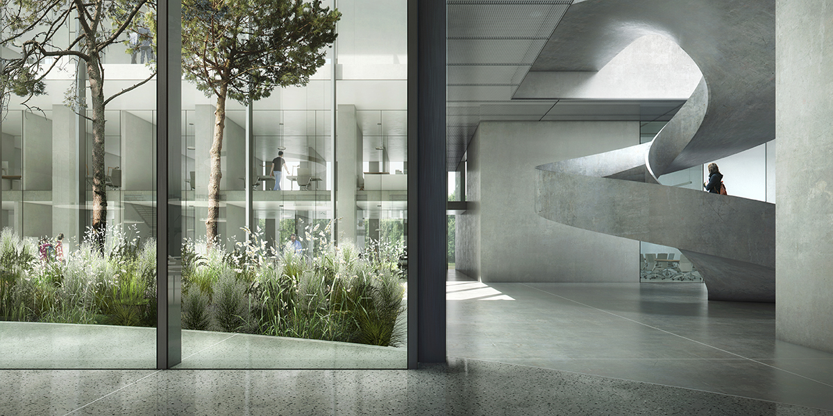
Interior
In this restrained, identifiable building with its clear architectural layout, the interior materials have also been kept simple and sober. Although not luxurious, they are high-quality and robust. The main layout of the interior is based on two kinds of space: public open space, and private space.
The public spaces are the traffic area, the open study landscape, the restaurant and the entrance hall. These areas have a flat, power-floated concrete floor and a light-grey expanded metal ceiling. Since the furniture ranges from long wooden tables to study at to colourful comfortable couches and armchairs to relax at, there is varied emphasis and these public spaces can be used in various ways. Features such as the staircases and the awning share a dark colour, creating a ‘family’ of accessories in the public area. The round, light-coloured spiral staircase is a conspicuous feature of the interior.
The enclosed areas are the lecture halls. These have a flat, power-floated concrete floor and a removable ceiling with integrated lighting. The technical installations are concealed. The par- tition walls are partly made of glass, with the doors in the closed sections.
Apart from these two main groups there are the self-study areas and the auditorium with their own range of materials. The auditorium has been given a warm interior. The floors, walls and ceiling are made of wood, so that the area is perceived as a whole. The slatted wood enhances the acoustics. At the same time the interior frames the view into and out of the heart of building. The wooden lines of the walls extend into the ceiling, creating a continuous interplay of black and wooden lines. The lighting of the lines is staggered, with a playful effect. The chairs have moss-green upholstery. Curtains allow the area to be darkened if necessary.
The flooring of the plaza is extended into the patios, creating a seamless inside/outside relationship. The covered section of the patios acts as a veranda, offering protection against the sun and the rain, and its benches allow people to sit out- side whatever the weather. The patios are full of vegetation, each in different colours. The pine trees refer to De Oude Warande. The indoor/outdoor relationship is a key theme in the building. The two green patios truly bring the outside inside.
“Sculptures in Public Spaces” by Dikkie Scipio
We take it for granted in Rotterdam, walking around in a city that is one of the greatest sculpture gardens in the world. How amazing it is to be able to stumble upon, lean against or sit on art – sometimes by world-famous artists – that gives our public space more meaning. How amazing it is to have the privilege to welcome or the right to object to the placement of new artworks – works that some cities can only dream of. We seem almost unaware of it.
Siebe Thissen is now providing us with a compendium, an excellent overview placing the art in its social and historical context, and allowing us to see the full wealth of art in Rotterdam’s public spaces. Leafing through this book fills me with pride. I see it as the ‘grand finale’ of an era, now that our ideas on public space are changing rapidly.
While public space used to be defined as space that wasn’t privately owned and was delineated by building facades and entrances, and where on occasion the space might have been entrusted to artists when conceded by the generosity of a builder/owner, today the line between public and private is slowly blurring. A new generation has emerged that no longer aims for possession, not on account of political ideals but because they do not see the point of ownership. It’s the backpack generation, those who were brought to school in the morning and told that their father, neighbour or grandad’s third wife would pick them up after school. It’s the generation that grew up with prosperity and the certainty of everything always being available, though not always from a single source or through ownership. It’s the generation that sees sharing as natural and is not impressed by ownership. The line between public and private is disappearing. The emergence and popularity of Uber, Airbnb and Green Wheels are the consequences. Even Porsche currently has a sharing programme!
So all this also has a significant effect on perceptions regarding the idea of public space. When the concept of ownership no longer clearly distinguishes the separation of public and private spaces, where exactly does public space begin and end? Or does it even end? The establishment of the first POPS, Privately Owned Public Spaces, are indeed already a reality. Insofar as I know, no artworks have yet been installed in these new public spaces that have shown any kind of different response to the space, but it is inevitable that there will be one.
Another exponent of this new sharing is the sharing of knowledge. Information used to be under private custody and traded, but now we are used to a networking and knowledge-sharing society in which it seems that having access to information is free. What we have overlooked, however, is that this is intellectual knowledge, not the know-how and experience that one physically builds by doing. It is the doing that is necessary to master a craft.
Now one of the things that make art in public spaces so special is how well they are made. They have to be, because whether they are free-standing or part of a building, they must have a suitable physiognomy and the right feel, as well as being robust enough to withstand the affections of the public and our climate. Also, the sculptures are often of such a scale that if they were not suitably constructed, they might topple or collapse under their own weight. Creating these works demands therefore not only outstanding artistry, but also a high level of technical craftsmanship. Much can be said about the meaning of the artworks, yet the skill with which these works have been made has long been taken for granted.
Just how unjust this is, becomes apparent when we recognise the serious shortage of real, skilled specialists. True tradesmen are few and far between; there are few craftsmen today who have managed to master, for example, glassblowing, the working and casting of metals, leatherworking, the many forms and applications of stonework, brickwork and concrete, and fabric, lace and pattern production. The list of ‘endangered’ trades seems infinite.
It’s a serious situation because to excel at a particular skill may require many years, even decades, of practice and patience. The urgency is clear from the fact that several multinationals have instigated programmes to recruit real craftsmen. Often older people and sometimes even the very elderly are being hired so as not to lose the knowledge once acquired and to share their expertise with younger people who can learn and pass on the value of the skill – skills that are often necessary to make excellent art.
I am grateful that Siebe’s book has lots of photographs of artists at work. It illustrates the importance of craftsmanship. It has often been artists, in fact, that have ensured that knowledge has not been lost. Let’s take serious note of this, for without craftsmanship there is no art in public spaces.
The timing of this book couldn’t be better. It contributes to awareness of the quality we should be surrounding ourselves with and, moreover, hopefully inspires a respect for the expertise necessary to achieve this. It also reveals to us our attitudes to public space, where the visual arts show us it is truly the discipline that opens our eyes to all the different ways of looking at the world – the ultimate public space. The world is changing at a rapid pace and we are here to experience it. How exciting is that?
One mould
The history and the actual planning and development of the Dutch urban landscape is all about water management.
It implies the entire control or balance of the water versus land situation and therefore also includes water as a part of the infrastructure of the country. Aspects as transport, sewage, drainage, storage are constantly measured in balance with reclamation and safety from flooding.
In the Netherlands the production of land or vice versa the flooding of land was and is used as a military, political and economical tool.
Any city in the Netherlands is somehow related to the water or partially developed on reclaimed land.
For Dutch this situation is as normal as breathing. Put a shovel in the ground and the hole will fill itself with water immediately. The permanent relation with the water throughout the history has also asked many sacrifices and has settled in the DNA of our culture. The expression ’poldermodel’ literally refers to the habit of dealing with societal issues by compromising and finding consensus among stakeholders.
One sometimes wonders why people wanted to live here? But it was exactly the smart exploitation of the complex relation to the water that lead in the 16th and 17th century to the ‘first modern economy’ in the world with a very dense network of small cities. Building these cities implied making or reinforcing the land, keeping it in place and making foundations in the water.
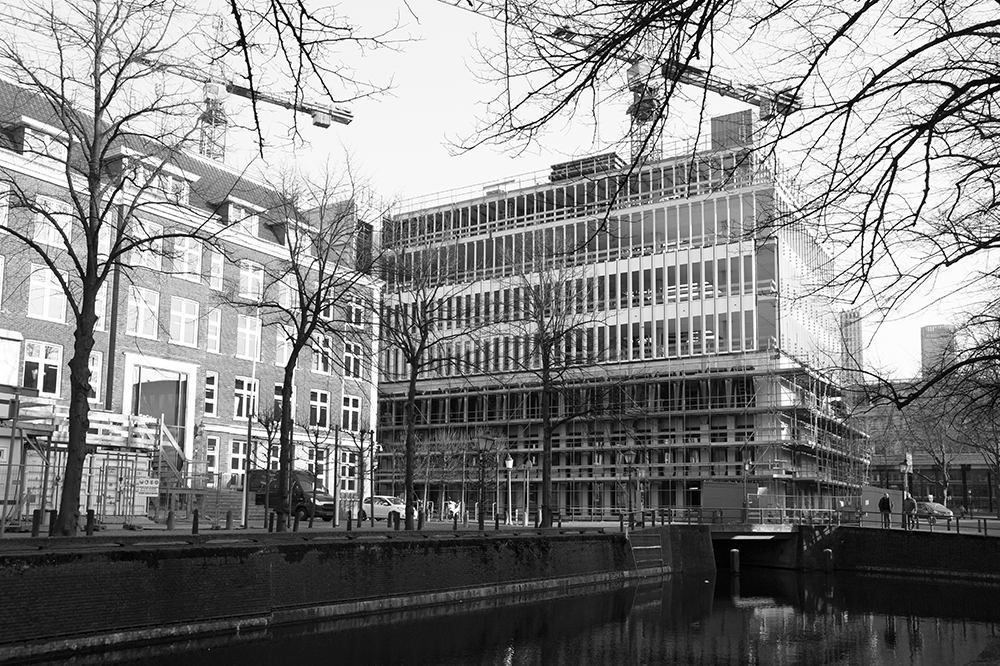
There is little stable and dry land available so not only buildings are constructed but so are the streets and the canals. The section canal, street and house are inherently related and intertwined. The houses are built out of the same bricks as the docks, streets and bridges and have similar foundations.
Public, collective and private interests are constantly negotiated in these complex constructions.
Globalization today causes large percentages of the world population to settle down in densely populated, sometimes dangerous deltas all over the world making land-reclamation techniques and proper water-management techniques extremely important. However also the conceptual impact and the political and cultural consequences will become tangible. Construction implies also construction of land and infrastructure and the complex public-private relations as a result.
In the sustainable urban territory the relation to water goes far beyond the technical aspects of land reclamation.
Sustainable High-Rise in Dutch cities
What is sustainable? And, could high-rise be sustainable at all?
Defining categories of sustainability identifies positive attributes in types of buildings, it is a relative system, there is no absolute value. We ask ourselves if high-rise is a type reflecting our dream of the metropolis or is there an economic necessity.
The choice whether to use high-rise for densification or not, depends on the existing urban tissue and a city’s cultural climate ready to absorb high-rise. In The Netherlands we have the luxury of building something for every need, we increase floor space to make cities emptier. As long as we do not develop proper high-rise knowledge and a broad culture of developing building and using high-rise we will not be able to address any real densification issues.
(text by Kees Kaan that has been published in the Book H. Meyer and D. Zandbelt, High-Rise and the Sustainable City Techne Press, 2012)
Download the PDF of the full text.
Architecture in the Netherlands
The current architectural debate is characterised by the threat of a split between proponents of change and renewal as the motive and motor of progress and the advocates of the tried and tested, and therefore timeless, skills and qualities in architecture.
But is it not the case that progress is found precisely in the equal recognition of change and constancy? In the equivalence of research and knowledge?
Time puts everything in its place. After all, the idea from which the object emanated, was just the cause and, at the end of the day a building is nothing but a tool facilitating human activity.
(text by Kees Kaan appeared in “Enigmatic Code of The Netherlands, Cities, Architecture and Design through an Architect’s Vision”; 2012; pp 03-07)
Download the PDF of the full text.
The Choice
The essence in making a choice is found in the source from which the choice is made. Making choices as an architect means developing a vision and making decisions based on that vision, understanding and taking responsibility for the entire design with all its implications. It is a decision out of which actions follow.
The fundamental points of departure in Architecture should not be found in the aim for a certain style or to follow the latest fashion, but in the wish and ability to act freely and to make the most of opportunities and make choices without prejudice, based on concrete facts that form the foundation of a project.
Attempts to deliberately express change in architecture are therefore unnecessary. Architects are part of the times they live in and thus buildings automatically will reflect the spirit of the age.
(text by Kees Kaan)
