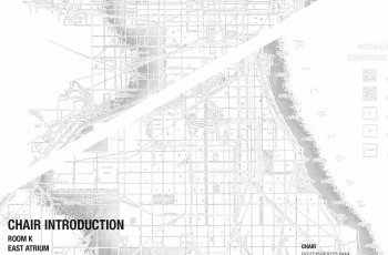
Chair Introduction – spring 2016
Tomorrow February 11th, 2016 (h 12.45) Kees Kaan will open the new academic semester of Complex Projects chair. ...

KAAN Architecten designs new building for Tilburg University (article originally published on OverHolland 18/19, 2017)
‘KAAN Architecten and the building firm VORM are together creating a large new building on the Tilburg University campus. With 11,000 square metres of floor area, the university’s Teaching and Self-Study Centre (OZC) is intended to offer students better facilities and hence further improve the quality of education. The building will have BREEAM (Building Research Establishment Environmental Assessment Method) ‘Excellent’ certification, the maximum achievable level of sustain- ability. Completion is scheduled for autumn 2017.
The KAAN Architecten design shows an OZC that is square and fairly low, like various other buildings on the campus. This means it will fit in well among the trees and the other buildings. Yet it is substantially different from the square central Cobbenhagen building, the former Catholic College of Economics that formed the basis for the university back in the early 1960s. Whereas with its two courtyards the enclosed structure by architect Jos Bedaux (1910-1989) brought the landscape inside the building, KAAN Architecten’s centre will blend into it. Abundant daylight and radical perspectives will allow the building and its surroundings to merge. The study areas will be enclosed in the same way as a woodland clearing.
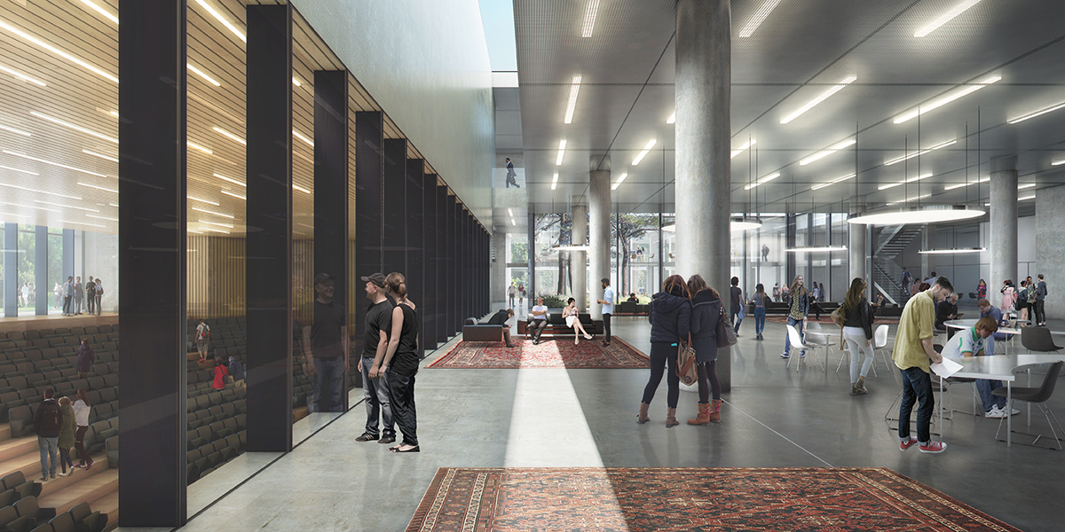
The OZC, which will serve all the university faculties, will be constantly full of people – up to 2,500 closely connected students and teachers. To maintain the open character of the building and avoid any sense of crowding, the centre will be spacious. Like all its areas, its corridors will be wide, light and up to 6 metres in height. The programme includes a large number of study and group areas, large and small, as well as a variety of lecture halls, all equipped with the latest communication facilities. To keep the building transparent, the centrally located auditorium is sunken.’
This was the text of the press release on the build- ing after the contract was awarded. This article will look at the project in greater detail: what were the ideas and arguments behind our design?
Relaxed dignity
Cobbenhagen, master plan, perception of space, Bedaux, dimensioning, verification and validation – none of this means much to the average student on the campus. When designing things, we archi- tects try to look through everyday users’ eyes. Of course, we bear in mind that these are not just today’s students and teachers, but also future generations, and we also realize that this building must be part of a set of buildings on a magnificent campus with a robust architectural tradition.
To students, the P, W and C buildings are places where they study at Tilburg University, and which they are not particularly critical of, but not particularly enthusiastic about either. But they love the new Teaching and Self-Study Centre. Nice and open, easy to find, and the sunken seating area is ‘chill’. They don’t use terms like ‘transparent’, ‘green landscaping’ or ‘logical routing’. As everyday users of the building, they simply think about what it’s like to walk to the building and attend lectures or seminars there.
When our students arrive at the campus, they mainly have a sense of pride about being able to study in such a fine place with its interna- tional air. All the greenery makes them feel as if they’re still on holiday abroad. The shrubbery is neatly pruned, the grass is mown. The gardeners are busy keeping the parkland tidy and smart. The first impression is one of fine buildings and green space. So easy to find your way around – everything’s where you expect it to be. As they walk to the OZC, students think how glad they are to have chosen to study in Tilburg.
Of course we also walked round the campus and saw the same thing with different eyes. What we saw was a compact greenfield campus with archi- tecturally high-quality, well landscaped buildings.
When you see the campus layout, it makes sense for the Cobbenhagen building to have a counterpart. The OZC site is destined for a building of campus-wide importance, just like Cobbenhagen. Both buildings have a prestigious appearance, and both are used by all the students and university staff, from every faculty. Cobbenhagen above all provides ceremonial facilities, whereas the OZC is there for day-to-day teaching activities.
The relaxed dignity of the Cobbenhagen building was the model for a contemporary response, the design for the OZC – a building combining the same dignity with relaxed user- friendliness. The OZC occupies a key position in relation to the existing buildings, and so contributes to a balanced whole. The design will give the north-western section of the campus the required architectural and landscape value.
Urban setting
The composition of the campus is marked by detached buildings that are freely and orthogonally located in space and are not aligned. The OZC is part of this spatial interplay. Its similar positioning, proportions and use of materials creates a dialogue between it and the Cobbenhagen building on the south side of the campus. Whereas the centre of the campus is marked by densified building along the main axis, the Esplanade, the Cobbenhagen and OZC buildings are more freely sited in space. The construction of the OZC will result in a balanced campus structure in which the OZC is part of the interplay of open, overlapping urban-planning spaces and unob- structed perspectives. We have also taken account of the spatial substructure, in which the route from the railway station plays a key part.
In the southern section the Cobbenhagen building stands free in a green cocoon fringed by trees. The northern section, formerly (and for good reason) nicknamed ‘the Wood’, will now have a similar character. We have enhanced the existing row of trees, the building stands free in space, and the landscape abuts directly on the building, further emphasizing the park-like character of the campus.
The design of the campus is mainly geared to use by pedestrians and cyclists. The green space to the south of the OZC therefore has winding footpaths and a fountain on a lawn. The building is anchored in the overall landscape by the orthogonal paved paths leading to the entrances and by the sunken terrace on the south side of the building.
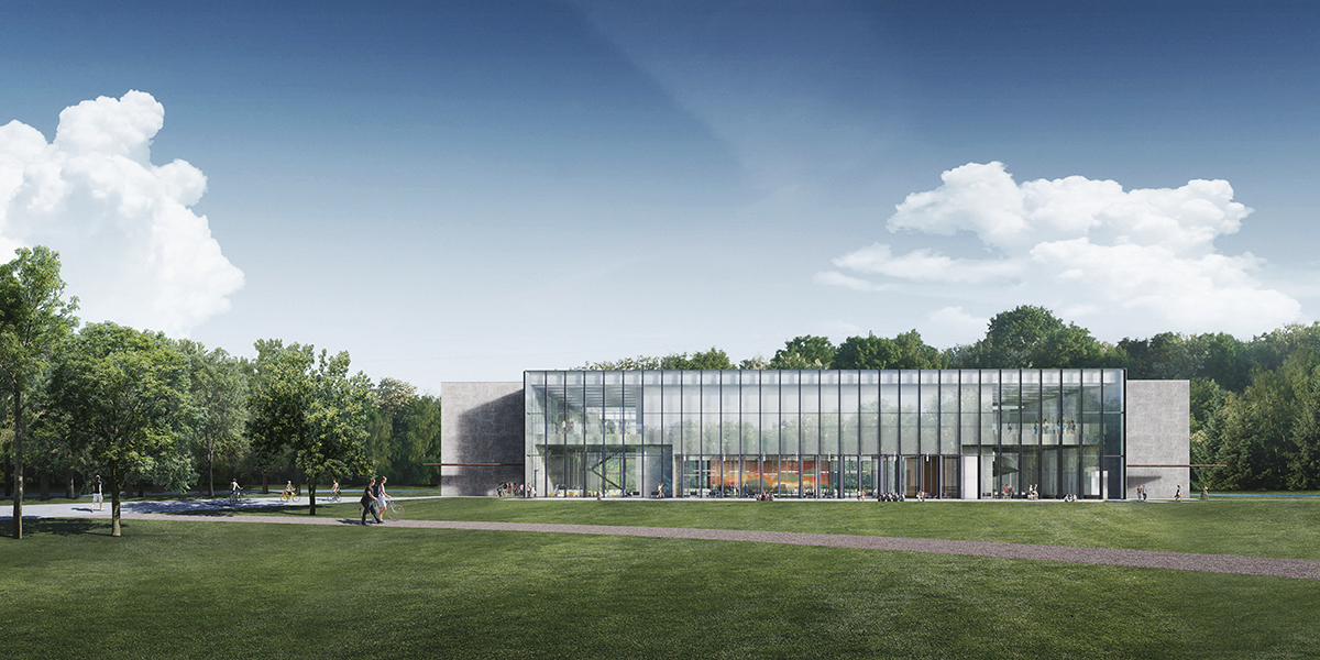
The building presents itself as more or less equal on all sides; the façades vary in openness, but are never perceived as closed or as rear sides. The east and west façades have the most sunlight in the mornings and evenings, and therefore have a more closed design. The north façade is very transparent, and lets the pleasant northern light in. The south façade, which receives a lot of sun, does not contain areas where people spend time, and so it can be completely transparent.
The logistically well-situated entrances on the south-east and south-west sides in the closed corners link the building to natural pedestrian routes on the campus. This siting frees up the south façade, and the OZC presents itself to the campus with the transparent auditorium and the study plaza to the rear.
Building typology
Dialogue with Cobbenhagen is also pursued in the design of the building. For an optimum relationship with the surroundings, we have eliminated any programme from parts of the façade, particularly on the south side. This choice has logically led to a patio building, for the patios ensure there is enough façade length to facilitate the complete programme of rooms. The sunken auditorium allows the building to be kept to just two storeys. The outlines, height and type are ultimately similar to Cobbenhagen, but the atmosphere and use are clearly geared to study activities.
We see the Cobbenhagen building as the flagship of the campus, the place where its DNA is in a sense stored. This is why we started by taking a close look at it. At first we literally attempted to make a copy of it, but with the OZC programme. Although this proved a good way to discover the qualities of the building, we saw that it was impossible to achieve the same spatiality with the chosen OZC programme within the Cobbenhagen outlines. The gross/net relations and the type of programme in Cobbenhagen were entirely different, with the main focus on prestige and ceremony. Yet the study greatly helped us to grasp the essence of the OZC and to assemble arguments that would make clear to the client why it should be a different kind of building.
The resulting insight into the spatial quality of the Cobbenhagen building and the study of OZC programme led us to a self-evident design which we then implemented: a building with two patios, with the lecture halls organized on the façade and the large programme sections in the centre.
Exact siting
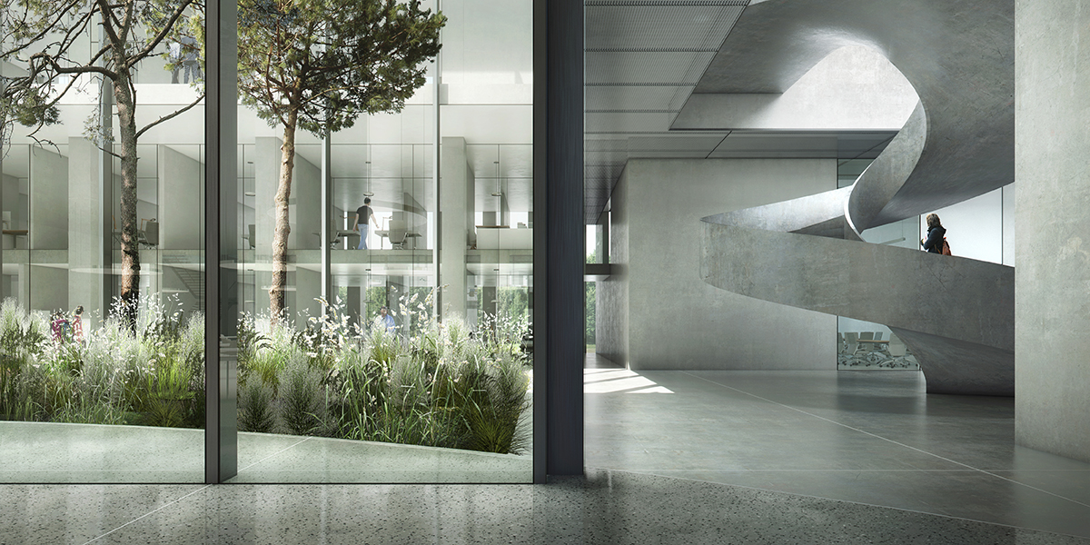
The final site of the building is determined by the distance from the surrounding buildings and the existing trees. Dialogue with the landscaping of the Cobbenhagen building requires some distance from the surrounding green space. Shifting the building as far north as possible has created more open space in front of the south façade and a maximum continuous area for parking. The transition from the façade to the green cocoon is almost seamless; the omnidirectional building is right in the middle of the grassy landscape, fringed on three sides by trees. The wind-sown pines in the patios are a reference to the trees in De Oude Warande.
The building marks the end of the north flank of the campus. The south façade is oriented towards the main axis of the campus. This façade is completely transparent, providing a view into the heart of the building – the study plaza. The indoor and outdoor areas appear to merge.
Perception of space
Perception of space in the building is determined by proportion, materials and light. It is greatly enhanced by the clear spatial structure, the proportions of the rooms and corridors, the materials used and the amount of daylight let into the building.
The ample dimensions have allowed the programme to be fitted easily into the building. The ground floor is inviting, and the height makes it feel like a truly public space. Together with the size of the study plaza, the patios, the outsize spaces and the transparency of the auditorium, this has created a generous building. The ground floor in fact forms a single landscape in which open study areas, lounge areas, traffic space and a restaurant alternate. Study and relaxation blend together in the heart of the building, where the study programme and multifunctional traffic space merge into a single vital space. The study plaza allows all kinds of different uses. With its transparency, the auditorium is part of this vitality. There is a direct sightline from the study plaza to the auditorium, so major events can also be experienced from here.
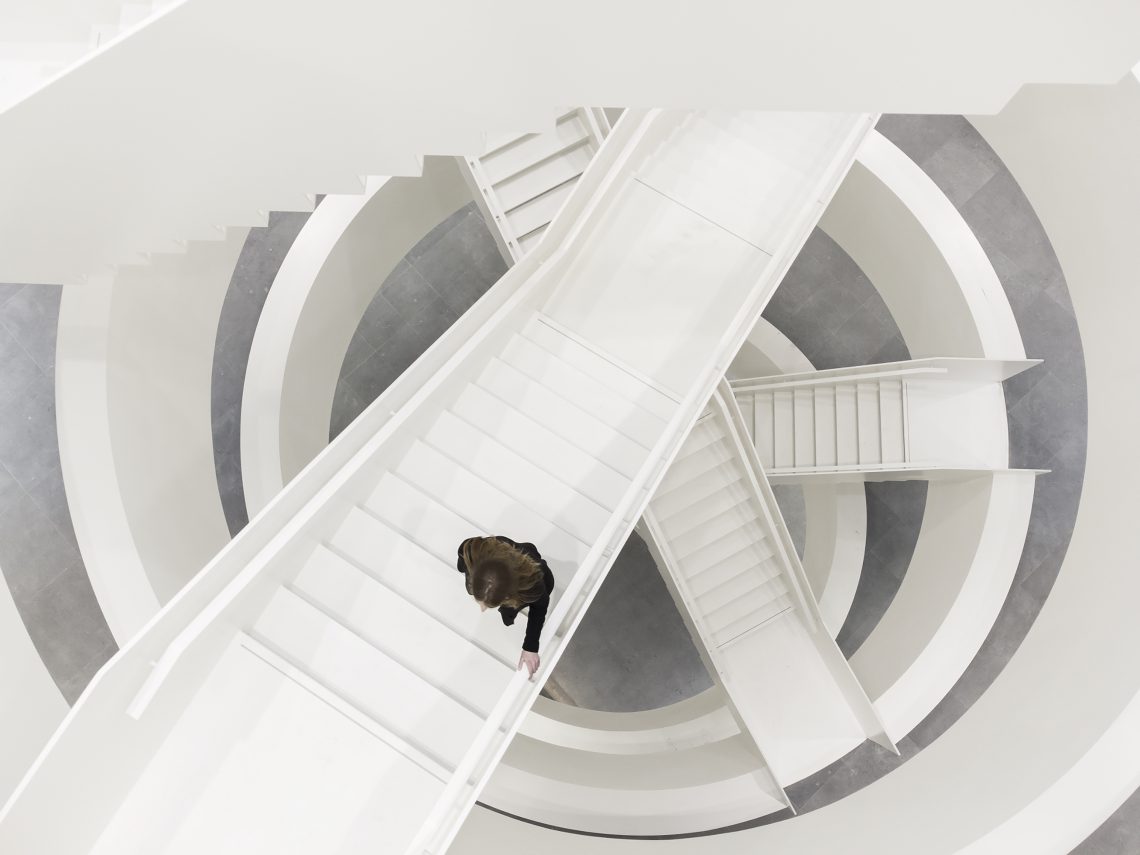
The character of the building is enriched by such architectural features as the monumental staircase in the entrance area. Large windows provide views of the magnificent campus landscape in all directions.
Spatial structure
To achieve spatial quality similar to that of the Cobbenhagen building, although with a smaller ratio and hence greater efficiency and based on different specifications, we again looked more closely at that building. The stratification of the design with its various perspectives through spaces, the generous height, the proportions of the spaces, the multi-purpose traffic areas, the indoor/outdoor relationship and the way in which the building is fitted into its surroundings were, in addition to the functional specifications, the ingredients for the structure of the design for the Teaching and Self-Study Centre.
The centre’s spatial structure is clear and simple, so that everyone can find their way around, in keeping with the public character of the building.
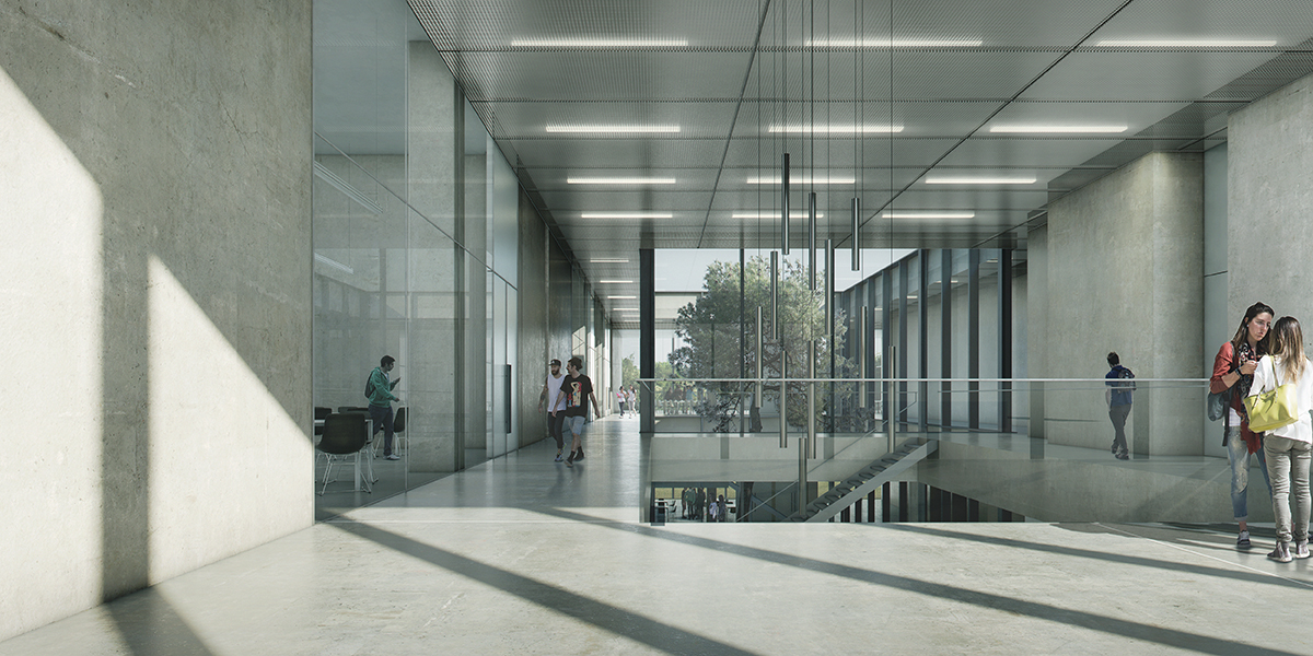
The auditorium is sunken, with glass walls, so that it does not seem like a closed box-within-a-box. From east to west there are two transparent axes that provide a clear view through the building. These are an inextricable part of the structure and ensure that daylight can penetrate deep into the building. Round the two patios are intimate self-study areas on mezzanines with a lower ceiling height. This sheltered location provides the peace and quiet needed for concentration and study.
Four open staircases leading to the first floor are divided equally over the building. Keeping these open necessitates special compartmentalization in the event of fire, but this is almost completely concealed. There are two lifts for disabled people. The first-floor lecture halls are located on the façade. Besides the auditorium, the basement includes one of the technical installa- tion areas.
The ground floor is designed as a large collective space, a landscape where people can study and take breaks. The programme is fitted in round the study plaza in a relaxed manner, with several views of the outside area. The inside location of the large volumes allows maximum flexibility on the outside, enhanced by the additional façade area round the patios.
To create an omnidirectional building and enliven the plinth, the areas that do not require daylight are wherever possible located in the heart of the building. This has enabled us to use façades for daylight and outside views, and to keep closed sections of façade to a minimum. The result is a symmetrical structure, with the enclosed volumes in the heart of the building surrounded by a spacious, multi-purpose traffic area and a transparent ring of lecture halls.
Users of every type of area can regularly see green space. All the lecture halls that require daylight are on the façade and provide views of both the surrounding landscape and the patios in the building. The landscaped arrangement of the patios, each with its own identity, incorporates the green character of the surroundings into the building. The indoor/outdoor relationship is also expressed in the use of materials. The plaza flooring partly extends into the patios, so that they are perceived as a single entity.
Pedestrian routes
Accessibility, clarity and self-evident internal rout- ing are essential if the OZC is to function properly. There are two main entrances on both side of the south façade that are directly visible from several directions and are easy to find thanks to the footpath structure.
Once inside, visitors immediately have a clear idea of the building and its spaces. The inviting monumental staircase near the eastern entrance is an eye-catching feature that points the way to the first floor. The staircase provides an unobstructed view of the study plaza in the heart of the building. The restaurant can also be reached via the southern passageway past the auditorium. Visitors coming in through the western entrance can immediately see both the auditorium and the restaurant. Here again there is a view of the study plaza and a staircase to the first floor. The lifts are easily accessible from both entrances, but deliberately concealed in the wall to encourage use of the stairs – another reason to keep the staircases open rather than enclose them in fireproof stairwells. The pedestrian routes to higher and lower floors are direct and short.
All the ground-floor and first-floor study and other areas have logical positions in the building and can be reached in a fairly self-evident manner.
Exterior
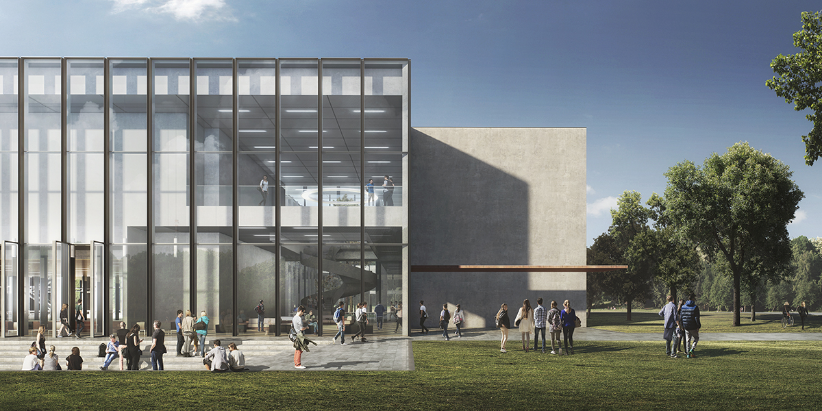
The building is designed in a restrained yet identifiable manner, and located right in the green landscape. Like the other buildings on the campus it is made of robust, pure materials. The exterior is a combination of stone, concrete, black aluminium and glass. Its robustness is enhanced by fine detailing and vitality in its use.
The façades, which extend from the lawn to the eaves, form a coherent whole despite their differing characters. From every angle the volume appears as a single entity. The division of the building into several storeys and spaces can only be discerned on second reading. The recessed corners are not only a simple way to give the building a powerful form, but also allow the use of large, unbroken stone surfaces that enhance its calmness and its compatibility with the architecture of the Cobbenhagen building.
The black lines on the glass north and south façades lend them more refinement. The vertical lines ensure that the volume is read as a single entity. Features that extend above the eaves are combined in a black-metal frame. Wherever possible, the roof is green and fitted with solar panels.
The south façade is made of glass from top to bottom, and provides views deep into the building. Behind it is a double-height space that detaches it from the internal structure of the building and acts as a beacon of light during the evening. The entrances in the recessed corners, highlighted by black canopies, are part of this structure, resulting in a simple interplay of planes and delicate lines. The building is deliberately focused on the south side, so that the various traffic flows converge in a logical manner, and the sunken terrace creates a close relationship between indoor and outdoor space. The French windows onto the terrace enliven the plinth. The sculptural appearance and simple use of materials give the building a timeless, restrained and elegant air.
Interior
In this restrained, identifiable building with its clear architectural layout, the interior materials have also been kept simple and sober. Although not luxurious, they are high-quality and robust. The main layout of the interior is based on two kinds of space: public open space, and private space.
The public spaces are the traffic area, the open study landscape, the restaurant and the entrance hall. These areas have a flat, power-floated concrete floor and a light-grey expanded metal ceiling. Since the furniture ranges from long wooden tables to study at to colourful comfortable couches and armchairs to relax at, there is varied emphasis and these public spaces can be used in various ways. Features such as the staircases and the awning share a dark colour, creating a ‘family’ of accessories in the public area. The round, light-coloured spiral staircase is a conspicuous feature of the interior.
The enclosed areas are the lecture halls. These have a flat, power-floated concrete floor and a removable ceiling with integrated lighting. The technical installations are concealed. The par- tition walls are partly made of glass, with the doors in the closed sections.
Apart from these two main groups there are the self-study areas and the auditorium with their own range of materials. The auditorium has been given a warm interior. The floors, walls and ceiling are made of wood, so that the area is perceived as a whole. The slatted wood enhances the acoustics. At the same time the interior frames the view into and out of the heart of building. The wooden lines of the walls extend into the ceiling, creating a continuous interplay of black and wooden lines. The lighting of the lines is staggered, with a playful effect. The chairs have moss-green upholstery. Curtains allow the area to be darkened if necessary.
The flooring of the plaza is extended into the patios, creating a seamless inside/outside relationship. The covered section of the patios acts as a veranda, offering protection against the sun and the rain, and its benches allow people to sit out- side whatever the weather. The patios are full of vegetation, each in different colours. The pine trees refer to De Oude Warande. The indoor/outdoor relationship is a key theme in the building. The two green patios truly bring the outside inside.
Kees Kaan joins the Tacit Knowledge (TACK) conference at ETH Zurich, organized by the ITN ‘Communities of Tacit Knowledge’
Tacit knowledge is integral to architectural culture, influencing the conception, design, construction, and utilization of buildings and cities. It shapes architectural education, distinguishes design office cultures, and drives collaboration among craftsmen, engineers, and architects.
Despite its significance, our understanding of tacit knowledge in architecture remains limited. Research on this topic has recently gained momentum, but further exploration is needed to grasp its specificities. Questions such as the roles of tacit knowledge in architecture culture, its relationship with other knowledge forms, and its ability to foster cooperative communities across disciplines remain unanswered.
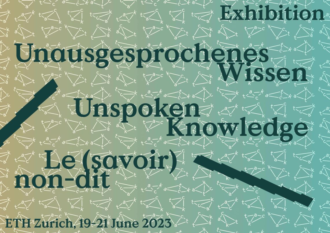
In light of these considerations, the ITN ‘Communities of Tacit Knowledge: Architecture and its Ways of Knowing’ is organizing a three-day International Conference at ETH Zürich (CH) from June 19 to 21, 2023. The conference aims to delve into tacit knowledge in architectural culture through lectures, debates, and interactive sessions. These will focus on a diverse range of tacit knowledge objects, including scale models, mock-ups, plans, drawings, details, letters, and digital-born artefacts. These objects will also be showcased in the accompanying exhibition titled Unspoken Knowledge.
We are contributing to the exhibition with two objects representing our interpretation of tacit knowledge. On the occasion, Kees Kaan joins as a speaker at the exhibition opening alongside Tom Avermaete, Janina Gosseye, Angelo Lunati and Mara Trübenbach.
Practical info:
“Unausgesprochenes Wissen/Unspoken Knowledge/Le (savoir) non-dit”
ArchENA, HIL D57.1, ETH Hönggerberg, 8049 Zürich
Exhibition opening: 19 June, 19:30 – 20:30
On Tuesday, June 13th, the Vereniging tot Bevordering der Bouwkunst (VBB) will be hosting Kees Kaan for a lecture in Groningen.
Entitled “Everyday,” the lecture will provide an insightful revisit of several selected projects by KAAN Architecten. Join us on June 13th at 20:30 at the RKZ Bios (Emmastraat 15, 9722 EW Groningen).
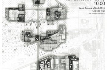
On 29 March, Dikkie Scipio will give a lecture at the Faculty of Architecture and the Built Environment at the TU Delft. Hers will be the closing lecture of the BAU business fair organised by the student association Stylos.
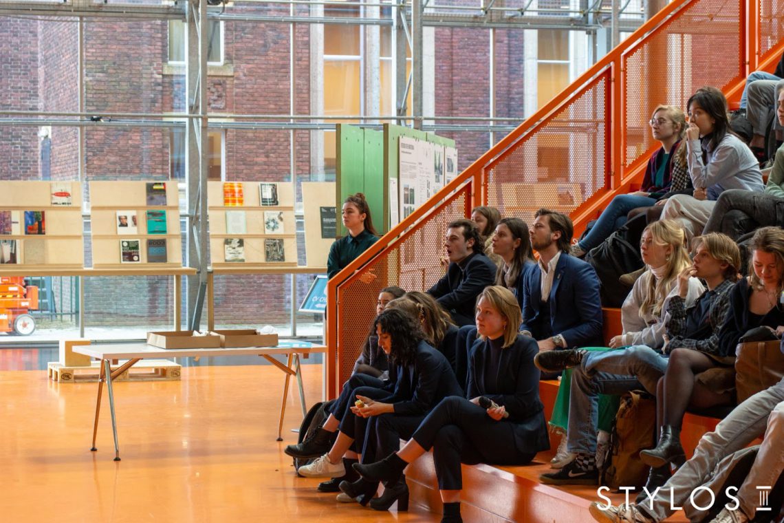
During the lecture, Scipio will share her insights and experiences both as an architect and entrepreneur. Join on 29 March at 12.45 in the Orange Hall of the Faculty of Architecture and the Built Environment. For more information, reach out to Stylos.
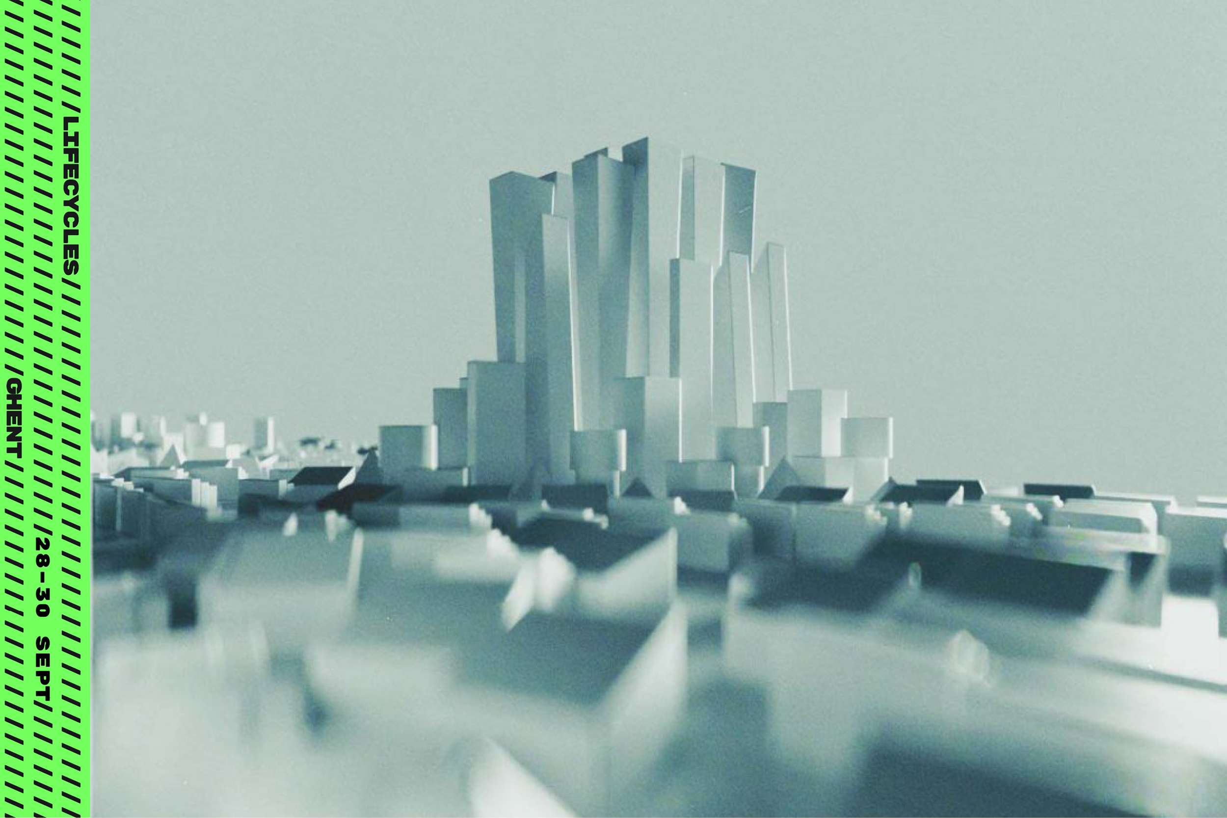
Lifecycles is a three day festival of inspiration and innovation, focused on architecture, project and city development taking place from 28-30 September in Ghent.
Dikkie Scipio joins a selection of forward-thinking innovators and experts who will be presenting their experience and insights, intending to set the agenda for the future. The curated program of the festival is built around topics connected to meeting future challenges of our cities, architecture, building industry, technology, environment and communities. The event will be unique in its kind, carefully curated and offer a great opportunity to meet all industry stakeholders.
In her own words, Scipio reflects: “In our urge to save the planet we are tempted to think about buildings like puzzles with little pieces that can be constructed and deconstructed as quickly and easily as it sounds. Little pieces that can be reused in their original state or decomposed to basic commodities in a process that doesn’t increase waste or pollution. However sympathetic this may sound, it also implies an expected devaluation and acceptance of the building’s short-term lifespan. This surrender to a fast consumer economy contrasts the intrinsic quality of architecture: the quality of shaped space, guided light, well-chosen and placed materials. It is this quality that outlives trends and even functions. Quality that lasts is always preferable over destruction, even when that destruction is called sustainable.”
Find out more and register to attend the event here.
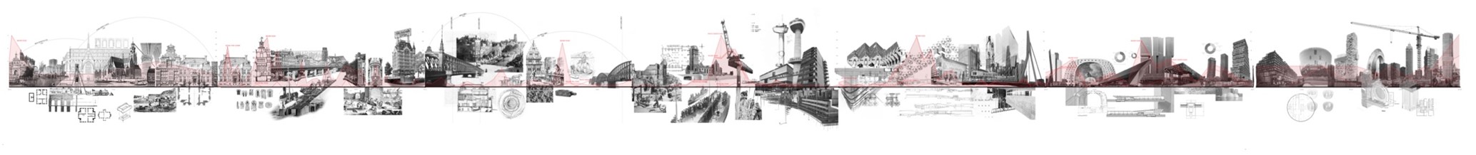
The exhibition and accompanying events are curated and designed by the students and instructors of the MSc 1 course Dutch Change organized by Complex Projects. From 29 April to the 2 May they will exhibit their work at De Heuvel building in Rotterdam.
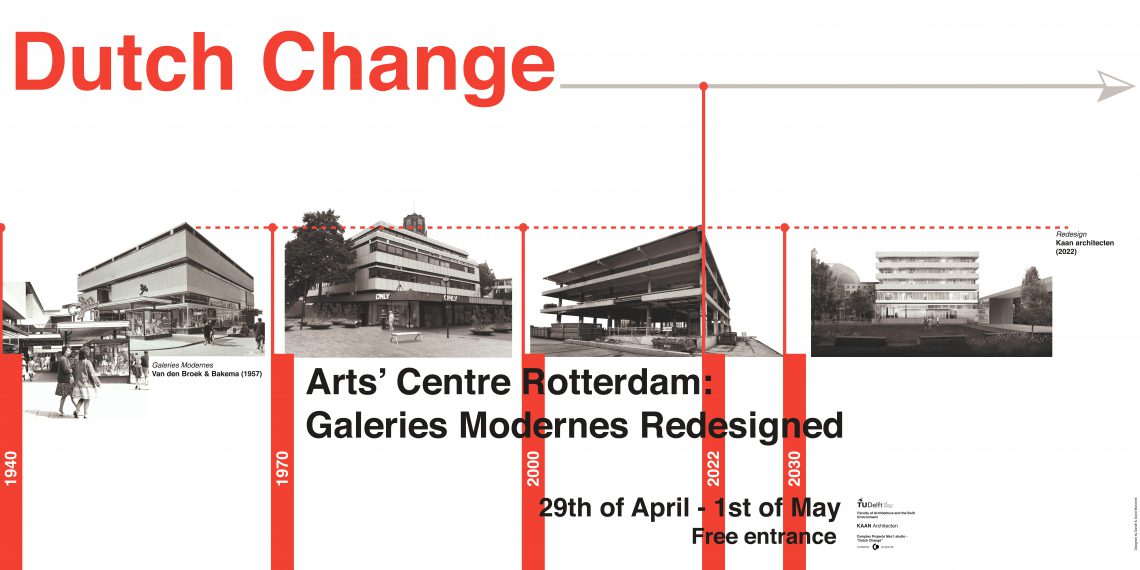
Based on thorough research on the urban development of the city centre and the local architectural culture, the students proposed an amateur art centre, annexe urban living room, for Rotterdam. The former department store Galeries Modernes, designed by Van den Broek en Bakema, forms the starting point of their designs.
The exhibition’s goal is not only to present the outcome of the students’ work conducted during the course but also to share their ideas with the professionals, users, and citizens of Rotterdam in general, to discuss and assess the relevancy of their architectural proposals. The character of the project asks for public exposure and public debate.
Located near the Laurenskerk and opposite the Galeries Modernes, the Foundation De Heuvel building is ideal spatial conditions for the events and provides the necessary platform for the students to share their ideas with the professionals, users, and citizens of Rotterdam in general, to discuss and assess the relevancy of their architectural proposals.
The exhibition is free and open for visitors from Friday 29 April at 17.30 to Monday 2 May at 14.00. See you there!
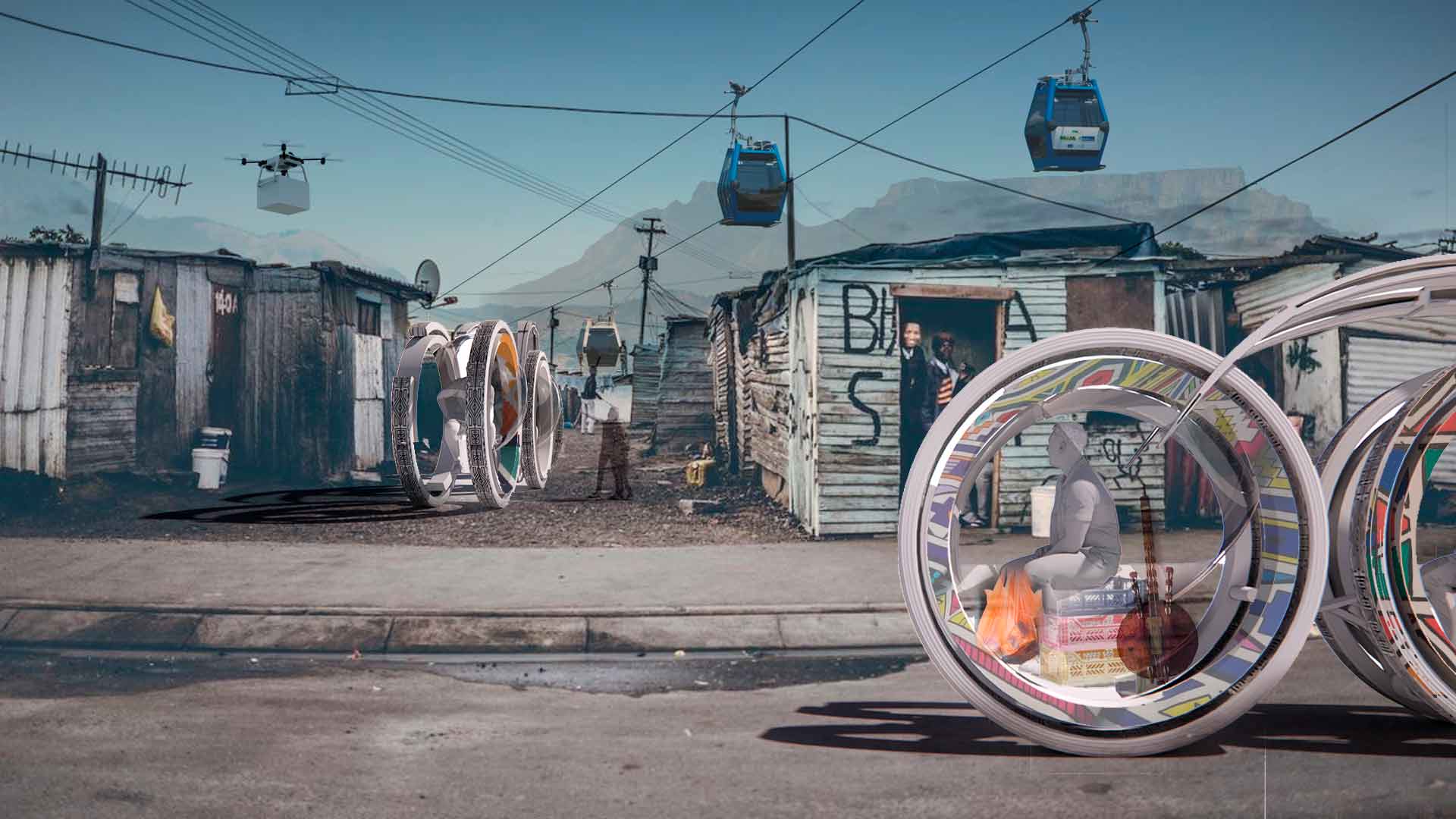
Together with the students of The Berlage Centre, the research team led by Kees Kaan, Juan Benavides, Salomon Frausto, and Dick van Gameren presents “The Auto Drives Architecture” – a contribution to the exhibition “Motion. Autos, Art, Architecture,” curated by the Norman Foster Foundation at the Guggenheim Museum Bilbao from April 8 to September 18, 2022.
How will the future car transform the architecture associated with twentieth–century highways and interchanges, from gas stations and car washes to parking garages and motels? What new types of architecture will emerge alongside the future car in the second half of the twenty-first century? How will the private space of the car continue to merge with the public realm?
The Motion. Autos, Art, Architecture finale is devoted to works by a young generation of students who were invited to imagine what mobility may be like at the end of this century. The exhibition’s journey comes full circle by considering the same problems that auto inventors faced more than a hundred years ago— urban congestion, resource scarcity, and pollution—all exaggerated by climate change and now projected onto the future.
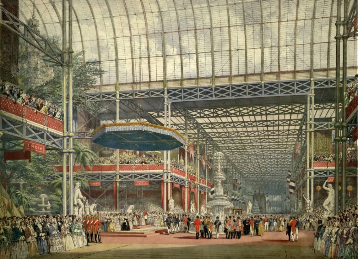
Guggenheim Museum Bilbao – catalogue image
Fifteen selected international schools of design and architecture from four continents were given complete freedom to share their visions for the future of mobility. Among them are the Delft’s Faculty of Architecture and the Built Environment and their Berlage Center for Advanced Studies in Architecture and Urban Design. The Auto Drives Architecture is a research project consisting of a multiformat program of expert symposiums and lectures, a design master class, a series of documentary films, the Guggenheim Museum Bilbao installation, and the publication entitled Architecture by Auto.
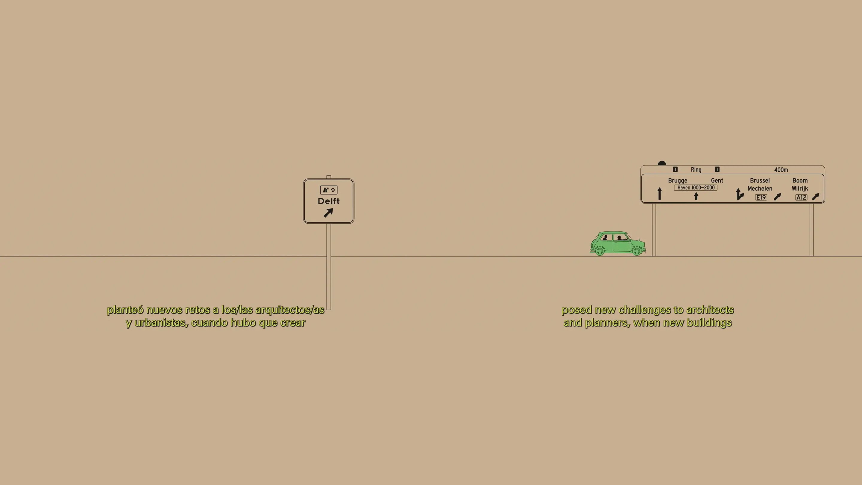
Organized and designed by the Berlage, the installation in the Guggenheim is sized according to the footprint of a typical parking spot and the volume of a car—featuring an animated road trip to twelve different buildings across the Netherlands. Travelling from an underground parking garage, filling station, drive-in pick-up point, drive-thru shopping mall, motel, and ridesharing hub, to a drive-in funeral home, drive-in cinema, battery replacement centre, auto camp, car wash, and showroom, the animation tells the story of how the future car—a Mini, the exemplar of a car designed for efficiency in the face of environmental crisis—could offer design opportunities for our buildings, cities, infrastructures, and territories.
Watch the full animation or find more information here.
Dikkie Scipio continues her quarterly columns for ‘de Architect’ magazine. Read the full essay below!
Available in Dutch here.
Alive, dead, and inanimate. These are the categories you learn in school: plants, animals and people are alive until they are dead; and glass, stone or concrete are inanimate, having never lived (at least not in a similar capacity). We can use living and dead things to feed ourselves and keep us warm. We can use inanimate materials to build things. It’s relatively easy to build a tent from branches and animal skins or a simple house from wood and straw. But dead materials are in that vulnerable state between living and vanishing: too wet and they rot, too dry and they can catch fire. So inanimate materials would have been better. Glass, stone and concrete are – if stacked properly – safe and permanent. Stone and concrete were the material of choice for important people and for security or stability where necessary. Plants were considered purely as useful for food and medicine.
One had to be very wealthy to be able to afford using land for something other than cultivation. Lawns as we know them today – austere planes of greenery with no purpose – were only invented when garden-architect André Le Nôtre designed a small tapis vert in 1662 for the gardens of Versailles. This was confirmation of the king’s extreme wealth. Motifs inspired by nature were certainly always part of the vocabulary of architecture and interior design. However, these were artful interpretations of plants and flowers, not living greenery.
It was only once sailors and adventurers returned to Europe from the colonies with hitherto unknown curiosities that living plants started to move indoors. Keeping and displaying a tropical plant in the parlour became the height of fashion. With the Industrial Revolution, increasingly filthy cities, and a diminished relationship with nature, the popularity of the plant as a decorative interior element grew. Joseph Paxton’s giant greenhouse for the Great Exhibition of 1851 in London, the Crystal Palace, attracted huge crowds. And in the meantime, machine-made reproductions of valued furniture were exuberantly combined with plants and decorative paraphernalia in overcrowded sitting rooms. An accumulation of so much poor taste spawned alternative directions, simultaneously between 1890 and 1914: the Art Nouveau, the Arts and Crafts, and the Jugendstil. Each style employed plant-based themes and excelled in craftsmanship and elegance.
Yet they didn’t last. The world wars put an end to the ability of old families to invest in craftsmanship in architecture, art and decoration. The demand for clean, healthy, light-filled architecture was met by Modernism. Ornamentation was renounced, though greenery remained important. Small and easy-to-care-for potted plants became part of simple home interiors, and the villas gained inner gardens integrated with interiors. There are some beautiful examples of this in the architecture of Berthold Lubetkin, Hans Scharoun, Frank Lloyd Wright and John Lautner. After this, the fashion of integrating living plants with architecture came and went. When the cities and the air became cleaner, the plants were left to die.
But then came the vertical garden of Musée du quai Branly by Jean Nouvel in 2006. Since then, many roof and façade gardens have been built, culminating in Milan’s Bosco Verticale, a structure comparable to the gardens of Versailles in their beauty, expense, and maintenance. The green theme is once again peaking and living plants are being installed everywhere into, onto, and around architecture in the most inventive ways.
Inescapably, ‘living’ also means maintenance. A living plant needs to be nourished and protected against diseases. Even a much-cherished plant can die. We are not very good at taking care of our surroundings and giving them the attention they deserve. Perhaps we’ll learn through our plants that we should also look after our buildings: achieving sustainability through the maintenance of quality. Now that the prohibition on ornamentation has been lifted, we may once again enjoy flowers and plant-like motifs on our wallpaper and upholstery. In the unlikely event that we are unsuccessful in our care responsibilities, we can always fall back on the precept that inanimate is still the safest bet.
Prof. Dikkie Scipio
Q4 2021 De Architect
Dikkie Scipio continues her quarterly columns for ‘de Architect’ magazine. Read the full essay below, focusing on the blurred lines between the public and the private space.
Available in Dutch here.
The 19th-century city was dirty. The housing was wretched and unhygienic. The streets were filthy, heaped with a combination of horse excrement and rubbish. Single dwellings were overcrowded and sanitation was either absent or shared and outdoors. Boundaries between public space and private domains were left undefined. The Dutch Housing Act of 1901 forever changed this. Light, air and space were the answer to the often miserable and unhygienic conditions people lived in. The concept of a healthy mind inhabiting a healthy body was born. And “healthy recreation” in public space made its debut. The new housing law not only ensured that eventually every home would have its own kitchen and sanitary facilities, but that there would be more green spaces for communal use, maintained by the municipality.
As a consequence, notions about public and private spaces changed. Gone was the ambiguity between the two. Inside the home was private and everything outside was public space, shared by all. This meant, quite literally, that public space was a formal domain where one behaved differently to when in private space. The separation was clear and dominated by written and unwritten social rules until the 1960s when behavioural norms started to relax. A new kind of optimistic social conduct emerged which encouraged a more casual interaction and looser demarcation between public and private, so that there would be room for everybody.
An excellent and typical example of this Zeitgeist could be seen in the architecture of the Dijkzigt University Hospital in Rotterdam, built in 1961 by architect Arie Hagoort and his firm OD 205, in collaboration with famous French designer and architect Jean Prouvé. The main floor of the complex transitioned from the higher Westzeedijk to the lower street on the other side and was designed as an open deck over two levels of parking. The deck was intended as public space and gave access to the various parts of the complex. The informal character of the space was further underscored by artist Peter Struyken’s work of concrete shapes with plants, water and benches. Unfortunately, the optimism was misplaced. The public took to the opportunity for access a bit too enthusiastically and since the space was not actually intended for the public at large, the hospital closed down the experiment, removing access to the roof deck and moving the entrances.
After this, the informality of public space nonetheless deeply penetrated social life. However, it did remain a shared public space not used for private purposes. The written and unwritten rules of behaviour applied to every street and park. Distrust of those citizens who were not adhering to the rules of formality translated over time into a design vocabulary that made it absolutely clear what was and what was not acceptable behaviour in public spaces. Hard paving, bollards, benches that made it impossible to lie down in them, greenery bordered by harsh edges – which were uncomfortable to sit on (to put it mildly) and certainly not conducive to congregation – became the norm. The fact that we are now questioning whether this uninviting design vocabulary is the best way to go reveals that we are transitioning in terms of how we perceive public space.
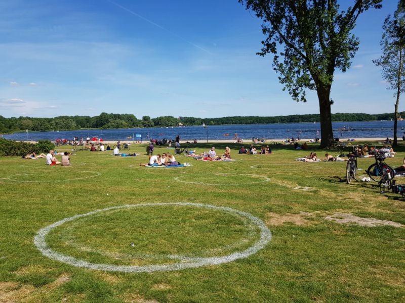
Since the beginning of this decade, something peculiar has been happening due to a combination of factors. High urban densities have made more people turn to parks and to using them differently. Cultural practices from Europe and farther abroad are being adopted, such as getting together in large groups and eating together in the park. More significantly, however, is that public space is no longer solely an outdoor entity. Public space is now digital and it’s impossible to completely shut yourself off from strangers. Your private space is now having to admit people – those you previously kept out – through algorithms, games, and Zoom meetings. As a result, the concept of private space has shifted from one of physical space to the physical body. Whenever possible we now make conscious choices in our outdoor encounters, the process being eased by the sharing economy where ‘sharing’ has gained a new economic definition that entails temporary ownership in turns. The pandemic, with its social distancing bubbles unintentionally formalizing our temporary boundaries, has accelerated how we now use public spaces as private spaces. The party and the BBQ in the park are not meant for the public around you, just as the yoga lesson, the work-out, and the dog training are not. Everyone knows that even though the teacher is standing in public space, you only participate if you have signed up or been invited. The space has shifted from public and formal to public and informal to public that is private.
Very different people with very different customs, behaviours and ideas now move freely among others in public spaces without too many issues. Imperceptibly, we have come to respect the temporary privateness of public spaces. Living Apart Together has thus entered our social realm.
This new development calls for more public spaces, which means not only parks and green squares, but also public spaces within our architecture. It calls for a new definition of the concept so that the typology of built public spaces, which has already slowly been evolving, can mature as an experience of togetherness without the burden of consumerism attached to it.
Prof. Dikkie Scipio
Q3 2021 De Architect
Dikkie Scipio continues her quarterly columns for ‘de Architect’ magazine. Read the full essay below, focusing on the relationship between the architect and the client.
available in Dutch here
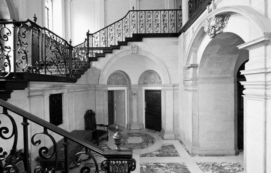
Sir Edwin Landseer Lutyens (1869 – 1944) was a British architect who built an impressive oeuvre of country houses, urban villas, public buildings and WWI memorials. One of his projects was a Neo-Classical villa (1908) for John Thomas Hemingway. A well-known anecdote is that during a site-visit with the client, Lutyens tells Hemingway that he wants to create a monumental black marble staircase. Hemingway replies that he doesn’t want a black marble staircase but an oak staircase, to which Lutyens responds: “What a pity”. At completion Hemingway beholds the monumental staircase and says with surprise: “I told you I didn’t want a black marble staircase”. And Lutyens apparently responded: “I know, and I said, ‘What a pity’, didn’t I?”.
As architects we hand these stories down with a sense of nostalgia. Those who have stood so firmly in their fight for quality, we feel, deserve their Starchitect status. We can now hardly fathom a world in which we could get away with such stubbornness. These are stories from a different era, long before the time of bulging-binder contracts, insurance claims, and lawyers. But even more so, these are stories from a time when the architect’s standing as a master builder and primary advisor to the client justified such eccentricities.
Today architects are selected primarily on the basis of compliance to detailed briefs outlining the technical, functional and spatial programme. A job is now so specified that it is immediately clear whether the client expects the architect to execute the programme as communicated, almost identically to the model in the brief, or whether the client seeks a ‘kindred spirit’ who will confirm the ideas presented and develop them further. While in Lutyens’ time architects were called upon for their experience, spatial and technical creativity, and ability to come up with an unexpected design that could surprise, amaze, and challenge, nowadays these aspects might lead to legal complications. It’s no wonder that only the most experienced firms know how to deal with this.
If we were to graft another Lutyens quote – “There will never be great architects or great architecture without great patrons” – onto our own times, then we see that our current reality is entirely different. Clients are very rarely a person. Most often they are complex organisations of investors, developers and users, represented by consultants and project managers, each with diverse political, economic and strategic interests. They do still exist, these independent individual clients with a vision and the means, land, and potential to realise a project in full freedom with an architect of their choice – but they are scarce. And I doubt whether these individuals today would accept a surprise like Lutyens’ staircase.
Perhaps it’s time to broaden the definition of who or what exactly a client is. Because: for whom do we actually build? As citizens, is it not ultimately for ourselves? Do we not have a duty as architects to build beyond the brief, or the programme as expressed legally. Just consider the quality of our public space, the quality of buildings that will be around longer than an expired depreciation period, the quality of our landscape. Or how about the benefits of developing of a long-term vision for housing and the environment we live in, or of new typologies and strategies to respond to social shifts?
There is a choice. Our profession is accustomed to having to be persuasive. Delivering more quality than requested does not require any permission or confirmation. We can continue to do this independently of our contractual obligations to the client. Even without them explicitly asking for it, without it costing them more in terms of investment and time, we are bound by our professional honour to add extra levels of quality. If great architecture can only be achieved by great patronage, then it is we as architects, urban planners and landscape architects who must step up and fulfil this role that has historically been allocated to patrons.
If it can be only one of Lutyens’ quotes that has stood the test of time, then I would choose this:
“I don’t build in order to have clients, I have clients in order to build .”
Prof. Dikkie Scipio
for De Architect
2nd quarter 2021
Translated from Dutch by Dianna Beaufort (Words On The Run)
Featured above: Hall of the Heathcote Villa in Ilkley by Sir Edwin Landseer Lutyens
On Friday, 26 February, Kees Kaan and Vincent Panhuysen of KAAN Architecten will participate in a webinar organized as part of the collaboration between both TU Delft and Lebanese Amercan University. This webinar will address the topics of reconstruction, urban planning, and heritage, connecting the Rotterdam experience with the current situation in Beirut.
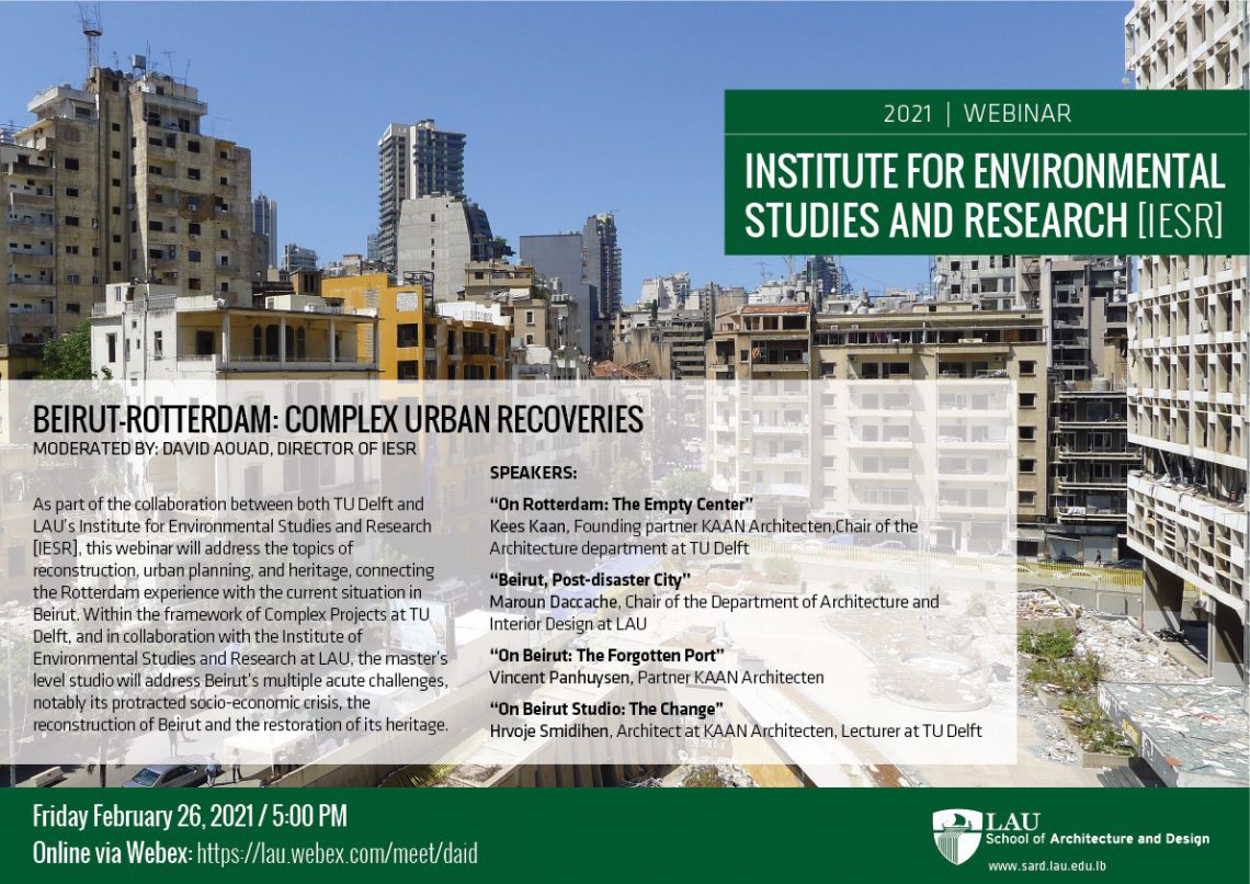
Within the framework of Complex Projects at TU Delft, and in collaboration with the Institute of Environmental Studies and Research at LAU, the master’s level studio will address Beirut’s multiple acute challenges, notably its protracted socio-economic crisis, the reconstruction of Beirut and the restoration of its heritage.
Join here for the webinar on Friday, 26 February, at 16.00h (17.00 EET).