17/09 2021
‘Beautiful but not perfect’ – a story of KMSKA
In 'Making of KAAN', we uncover the stories behind some of our most known projects as told by the designers who worked on them. Through personal anecdotes and lessons learned, meet the team that makes KAAN Architecten. For the first edition, we spoke to Walter Hoogerwerf, the project leader on the renovation and extension of the Royal Museum of Fine Arts in Antwerp. Find out how this process shaped him as an architect and his favourite memory of the project!
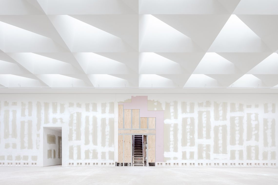
The process of renovating and extending KMSKA has been at the same time delicate and respectful to the old building but in other parts quite radical when it came to building up the extension. How did you navigate between the two approaches?
Interesting topic. First of all, I’ve never considered it as two different approaches. For me, it is one project where every part was worked on with the same delicacy, attention, respect and, indeed, radicality. Although the monument required more time researching on-site, working with the unknown and dealing with surprises to get, for instance, the same level of integrated details we designed on paper in the new extension.
In our vision, the new spaces are a completely different world with new experiences and possibilities, set apart from the monumental spaces. Therefore, the materiality of the two also required a big focus on contrast. In the monument, we searched for the artisan, the craftsman’s hands, the oak and the wax, the age and the wear, the scale and the weight. At a certain point, I had to explain to the plasterer not to make the walls too smooth, the parquet installers not to close the gaps, things like that. Beautiful but not perfect, matching the monument. Smooth straight surfaces were for the new museum. A similar thing about the paintworks; no perfect spray in the monument but visible brushstrokes. Even on the ceilings.
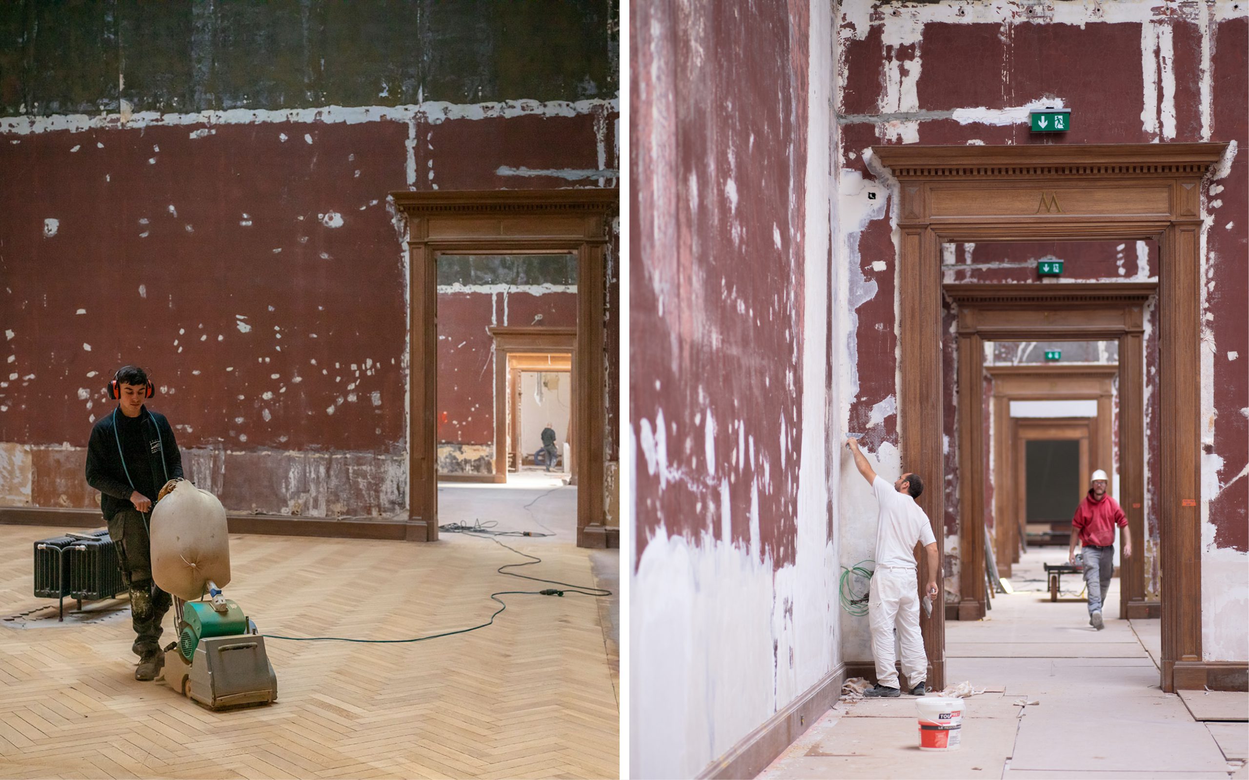
L: Karin Borghouts, R: Toon Grobet
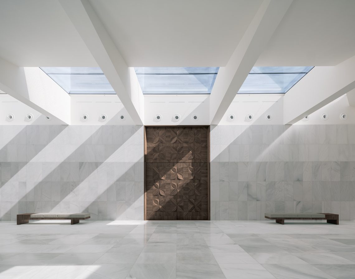
The abstract immaterial spaces of the new museum had the same attention to materiality. Choice of paint, delicate PU floor with depth, floor boxes in marble and messing, infamous zero-point details, immaculate skylight, those kinds of things. No visible marks of the craftsmen, of the effort, of the engineering, but even more necessary so.
We were also quite radical in the monument to resuscitate it; no small changes were made. The colours, for example, are a far cry from what they were; we’ve even inverted the wall-ceiling contrasts. Most colours were not exactly what we measured but were made more saturated, some colours darker, some colours acting as an intermediate. All decided after applying test surfaces.
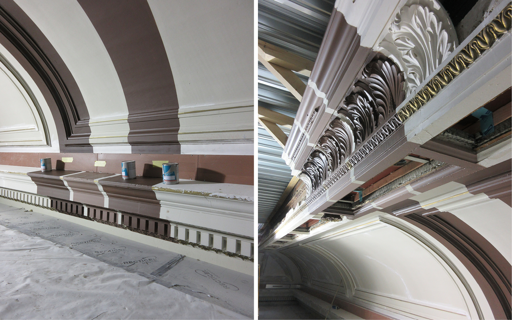
KAAN Architecten archive
Radical breaches in the monument were necessary to give the new museum its hidden routing possibilities. On the other hand, the new building, where the installations were built in two technical towers and main air distribution filled an entire floor, serves as an infuse for the monument delivering air, heat and cooling. The new and the old need each other; they rely on each other functionally, technically and materially. That is why it is one project and not a monument with an extension.
The project itself took around 17 years, from conception to finish. The conditions for which it has been designed and in which it will continue to live have changed during that time – how do you keep a design relevant to conditions in flux?
This is a situation that is a reality we are facing in almost every project, although in different proportions. 17 years is a lot, but it took a good 6 years of contracts, master planning and budget finding before the design work could start. We had a good concept, widely supported, strong enough, but not too determined, able to remain all those years: hidden new museum built up within the courts of a revived and freed monument. We could keep using it as a starting point with every new development, enhance it and improve it. We fitted new developments within this framework, and under our control, we kept the consistency in the project.
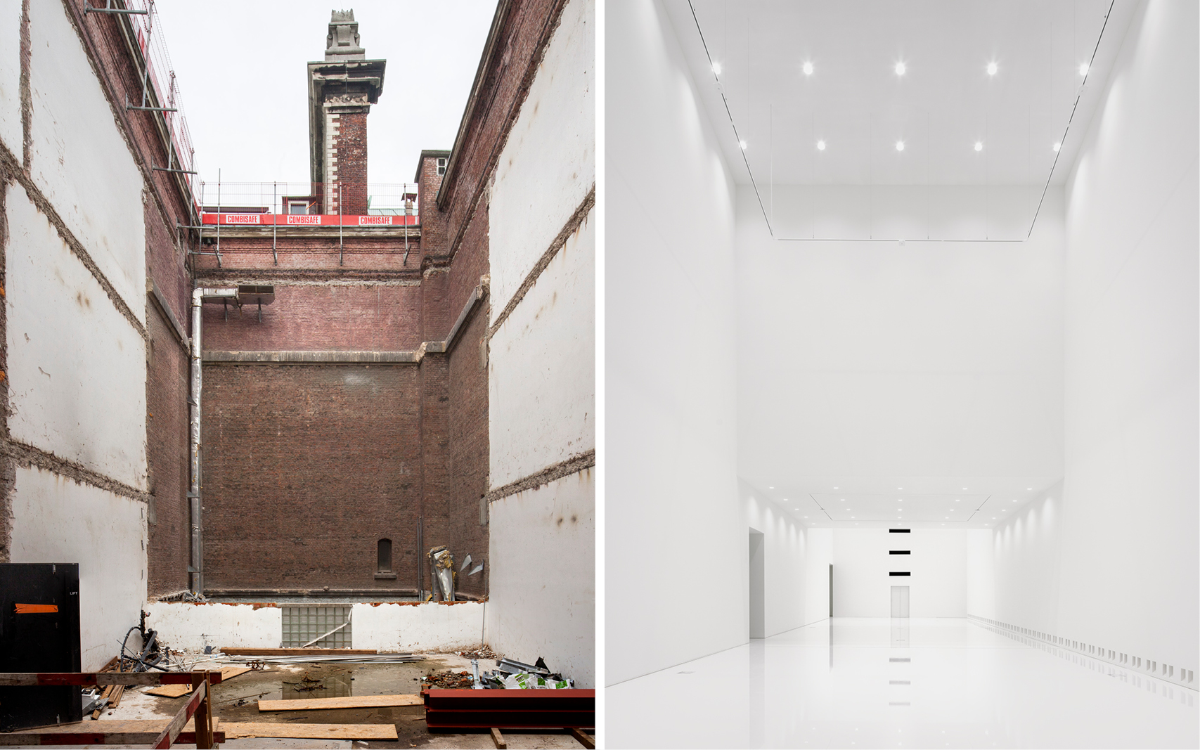
L: Karin Borghouts, R: Stijn Bollaert
What iterations and changes did you have to make?
One example of this is the redesign of the public facilities with a more generous restaurant, shop and receptions facilities. In the design of phase 2, the budget had to be focused on exposing and preserving the art and the monument for the community. Public facilities, or more precisely, commercial facilities, had to be modest. In 2017 KMSKA changed from a government agency to a non-profit organisation, with more autonomy on finance and development. At the same time, the expected visitor numbers had increased. These conditions made possible, and for KMSKA necessary, a redesign of the public facilities. We could stay within our defined public zone at the front of the building. In fact, extra square metres were found by moving the library office to the back of the building. This way, the entire front became public, and the library reading room became more prominent, with event possibilities.
Most importantly, we had the commissions for all the major phases and disciplines in my team; phase 1, phase 2, security, public facilities, offices and ateliers. This allowed for all these parts to be as consistent as a project can be. With other parts, the ones out of our control, the consistency is not self-evident.
I can only assume this is the longest-running project in your career, and as such, it must have shaped you as an architect – what are the lessons you learned along the way?
It definitely shaped me as an architect. I’m in my 12th year on the project now with one more to go, and I must say it is hard to imagine not working on it. I’ve got the chance to work on it from the start of the preliminary design, from the first phase all the way up to the delivery of the final phase. I was always very aware of how rare that is, but also that I wouldn’t want it any other way.
I learned how vulnerable a project is in this kind of long process. Everything could have and did, in fact, happen. Imagine changing four ministers of culture and three museum directors, new personnel in our design teams, the client’s team and the KMSKA team. Also, imagine working without a set budget and programme at the start. At a certain point, you become the guardian of the project, and I liked that. I noticed recently that it is hard to let that go.
Another thing is the importance of investments in personal contacts. Not only to make sure the mutual understanding is enduring but also to build what we’ve envisioned. I realise that what we designed is in many ways quite out of the ordinary and needs enthusiastic collaboration to get built. Together.
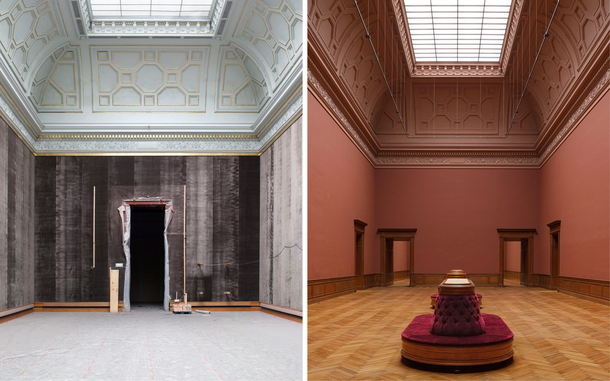
L: Karin Borghouts, R: Sebastian van Damme
Then there’s bound to be many interesting stories from such a long collaboration. Does any particular story or anecdote stand out?
There are so many, but one that is very dear to me is about colours. Halfway through the construction, doubts were raised about the colours of the museum spaces by someone external to the design process (see my previous point about vulnerability). There was a big debate about our design with the clear white, night blue and saturated dark reds, greens and browns instead of their suggestion to make everything light grey. Indeed, everything in light grey – walls, ceilings and wherever possible, also the floors.
Our approach to clarify this situation for everyone involved was to prepare for a meeting meticulously. We built up a clear argument and made a presentation that outlined our design’s intentions and results compared to the light grey one step by step, from the generic to the specific, with the projected artwork and big colour samples. All this without judgement, relying very much on the quality of our intent. At that time, the most precious artworks of the KMSKA collection were exhibited in an early 17th century premises in Antwerp: Rockox House. We proposed to meet there, among the art, to make the subject tangible and, most importantly, to prevent a theoretical discussion. A new context can be an eye-opener.
This meeting cleared up the subject very well for everyone, as you can see in the built result. To drive the point home, we took the colour samples to the paintings. There I was holding a large NCS 4550-Y90R sample right next to Fouquet’s Madonna surrounded by seraphim and cherubim from 1456. We showed the wall colour samples next to different paintings and got the KMSKA team of art historians assured and even more enthused. In fact, it generated the decision to have another series of rooms, the so-called “salon”, coloured in dark green because it matched better with the artworks planned for those rooms.
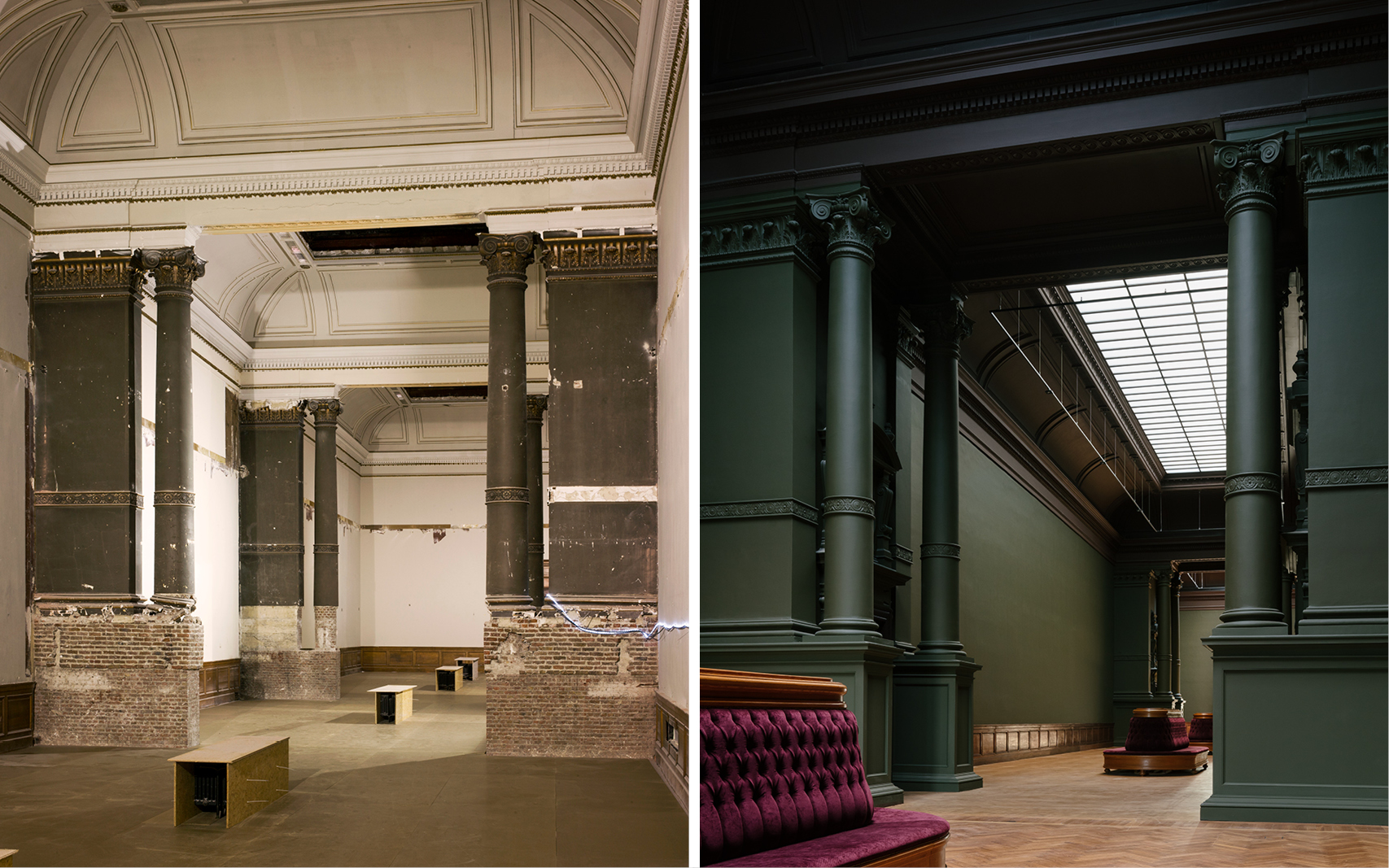
L: Karin Borghouts, R: Stijn Bollaert
Many museums ask for rooms as neutral boxes to be filled and coloured by the exposition works. I think that is an unnecessary pity. In KMSKA, we managed to keep the architecture’s coherence, the vision of the monument and the new museum all in harmony with the art. And colour played a more significant role in this than I could have imagined. Our goal for the KMSKA is not only a beautiful, well-built container to experience and preserve the collection, but having the building as a part of the collection, part of the experience with a presence of its own. I’m sure we have achieved this. I can’t wait for the opening.
————–
Walter Hoogerwerf is a project leader at KAAN Architecten currently working on the last phase of the Royal Museum of Fine Arts in Antwerp, as well as the renovation and extension of Paleis Het Loo in Apeldoorn.
Interviewed by Valentina Bencic. Featured image by Stijn Bollaert.
Explore the museum under construction in the video below!
